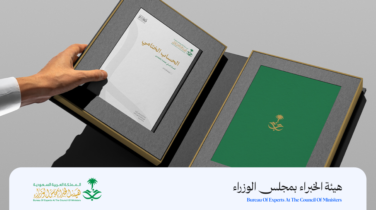
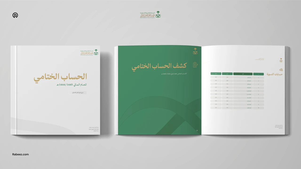
An identity shaped to reflect both authority and clarity.
The challenge
The goal was to develop a visual identity that reflects their official status and advisory role, while bringing order and consistency to its existing materials. The work focused on organizing scattered applications, improving clarity, and maintaining a formal and respected tone. The identity also needed to be practical and easy to use across departments and external communications.
What has been achieved
We developed a structured and unified visual identity built on clear rules and consistent use. By refining key elements and introducing clear guidelines, the Authority gained a more organized and confident presence across all touchpoints. The result is a professional and dependable identity that reinforces credibility, supports daily use, and reflects the Authority’s role with clarity and confidence.
Scope of work
Logo and visual identity development.
Graphic system.
Brand applications.
Brand guidelines.