
Where Saudi real estate ambition rises, an identity shaped by precision comes to life.
The challenge
The challenge began with the brand’s need for a transformative shift that would establish a stronger presence, elevate its formal and refined image, and open the door to future expansion. The company sought a visual direction that communicates accuracy and professionalism, alongside a verbal identity rooted in authenticity and high values. The tone of communication needed to remain elegant and refined, in harmony with the company’s services and its diverse real estate portfolio.
What has been achieved
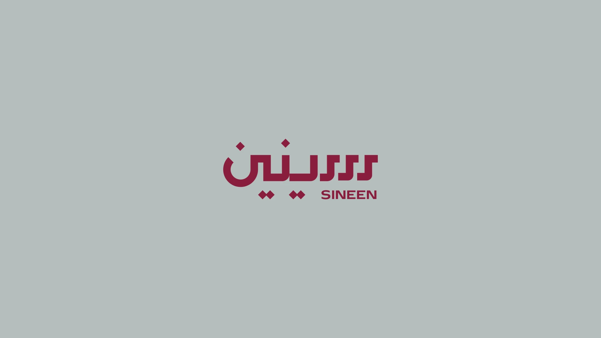
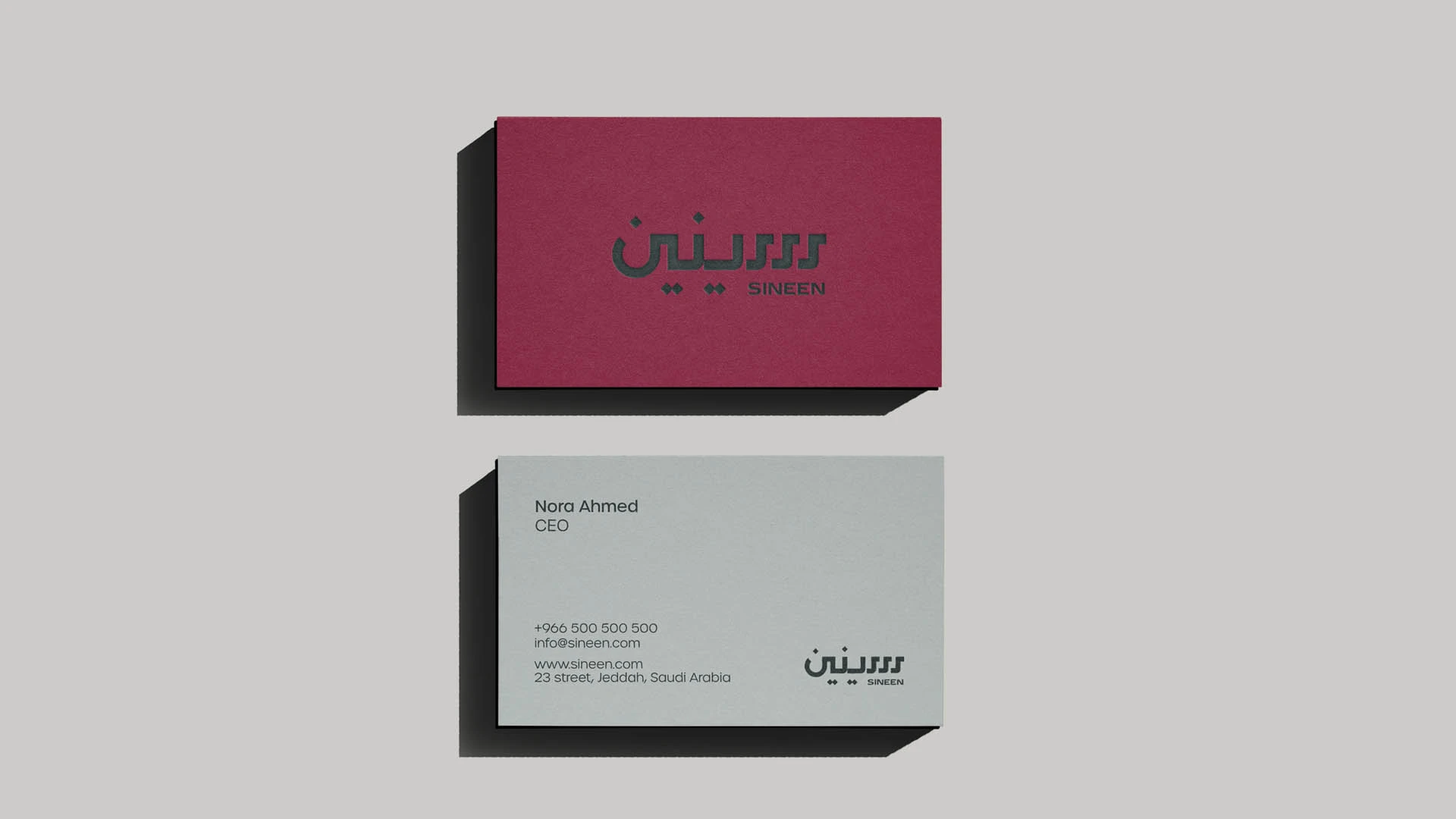
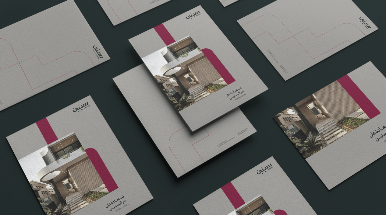
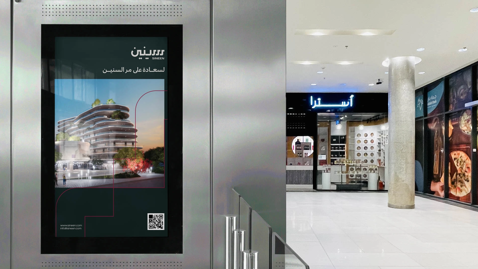
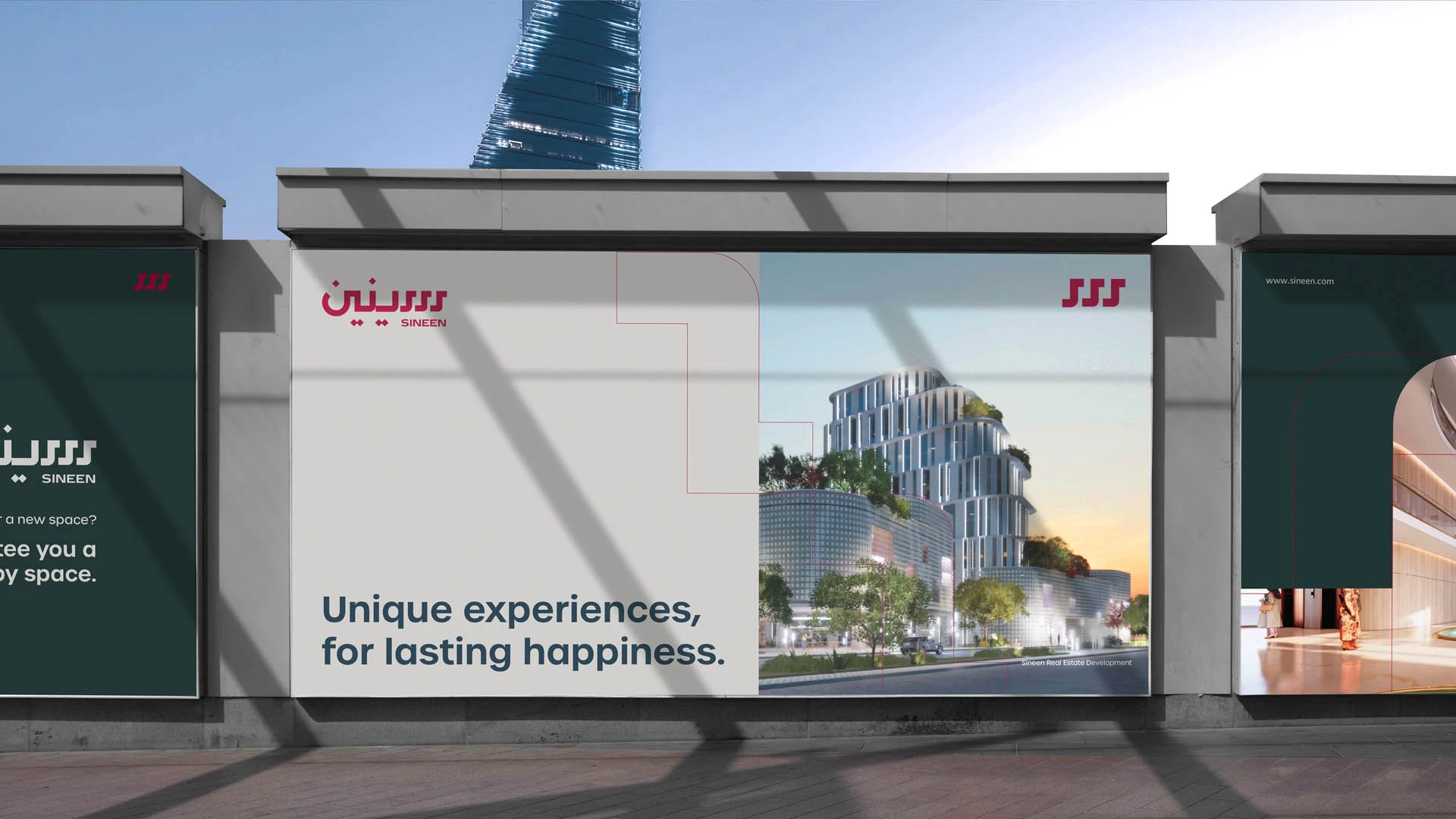
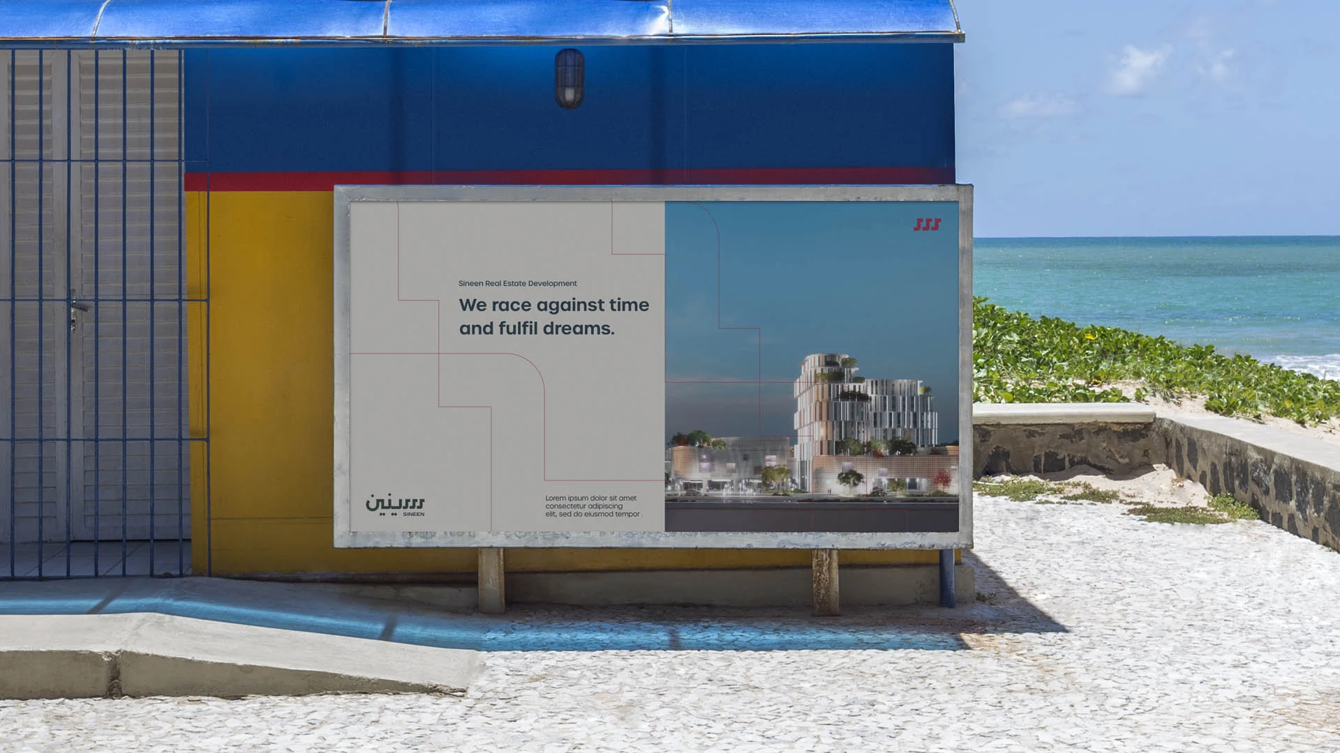
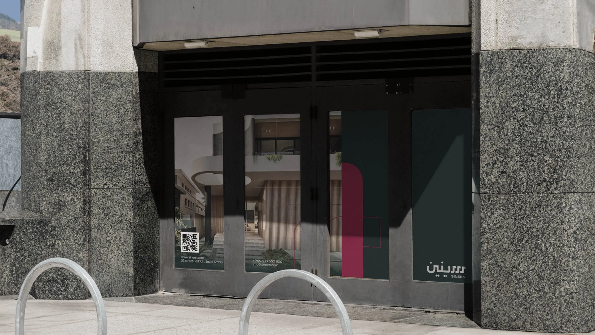
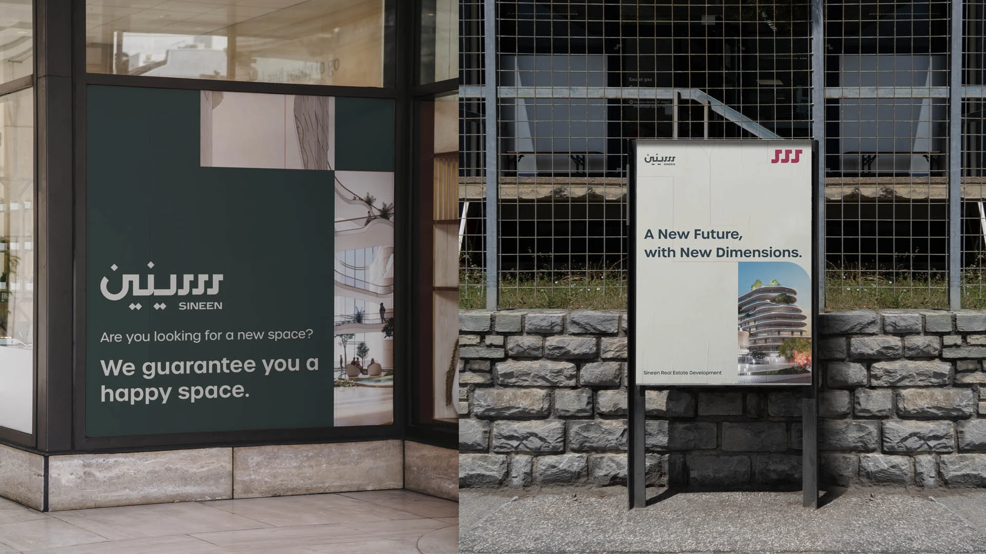
After an extensive journey of research and development and both strategic visual and linguistic refinement, the Sineen identity was born as a fully integrated system. It brings together the strength of the name, the symbolism of the blessed mountain, the elegance of calligraphic signatures, and a refined architectural language supported by a sophisticated color palette.
Today, Sineen stands as a solid presence in the real estate sector, with an identity that speaks clearly of professionalism and balance. It communicates the quality of its services with clarity and transparency, while supporting the company as it moves confidently toward expansion and a future shaped by opportunity and new challenges.
Scope of work
Brand identity development.
Naming.
Brand strategy.
Graphic system.
Brand applications.
Brand guidelines.
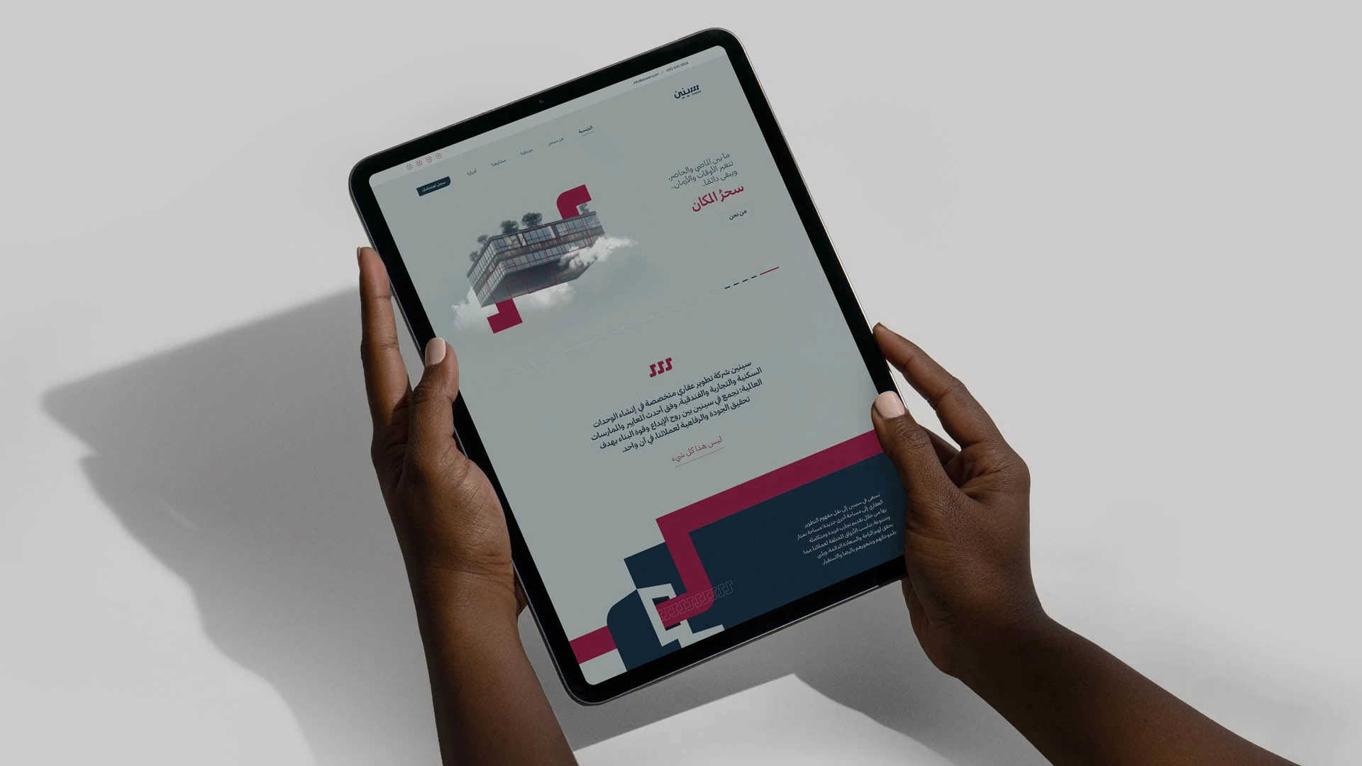
Website design.
Company profile.
Brand messaging.