An identity defined by fluidity, inspired by the road and shaped by years of trust.
The challenge
With a long-standing alliance between two major entities in the transportation sector, there was a need to create a new identity that reflects the strength of this partnership without diminishing the legacy of either brand. The challenge was to build a visual character that conveys professionalism, respects history, and accommodates the ambition and evolution of the next phase.
What has been achieved
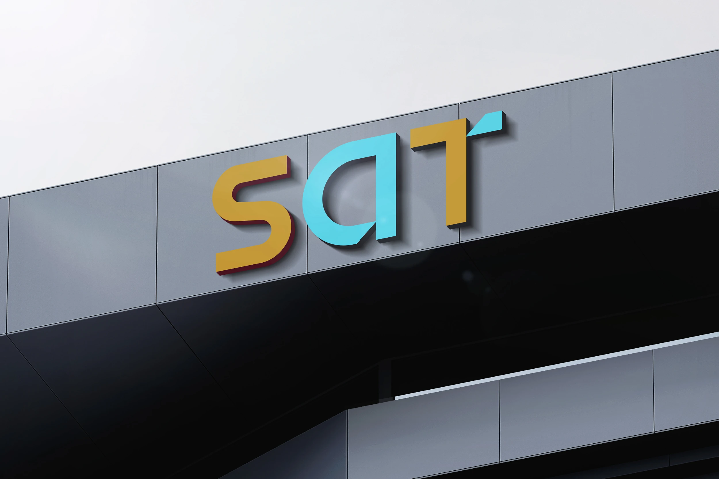
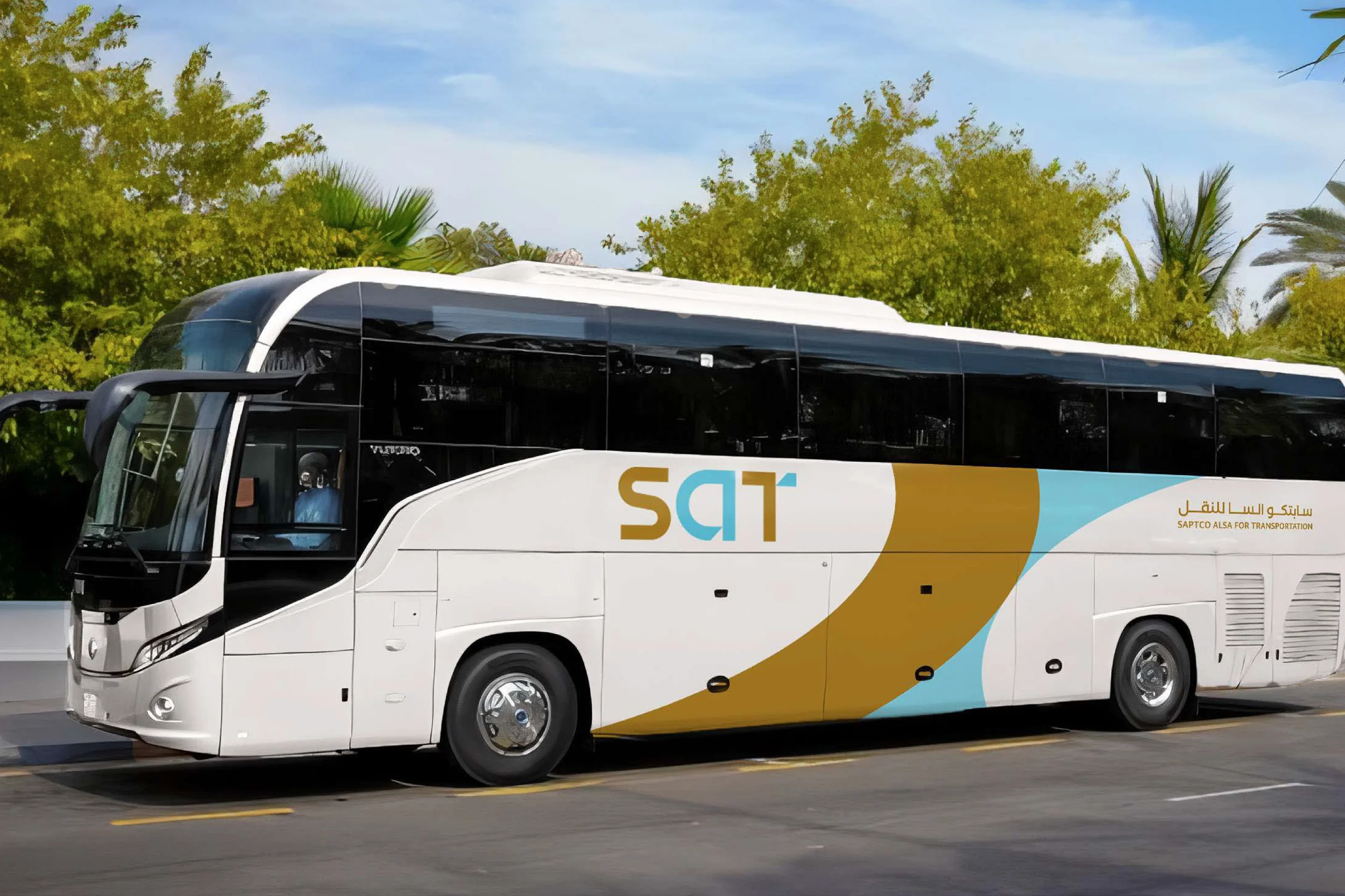
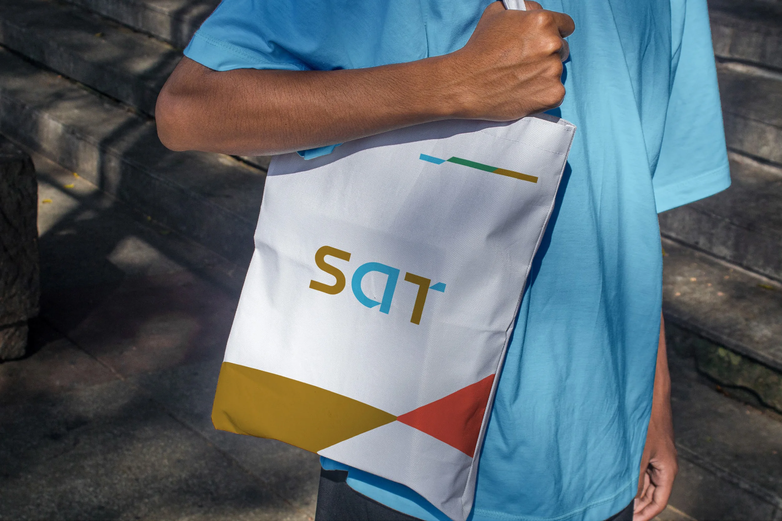
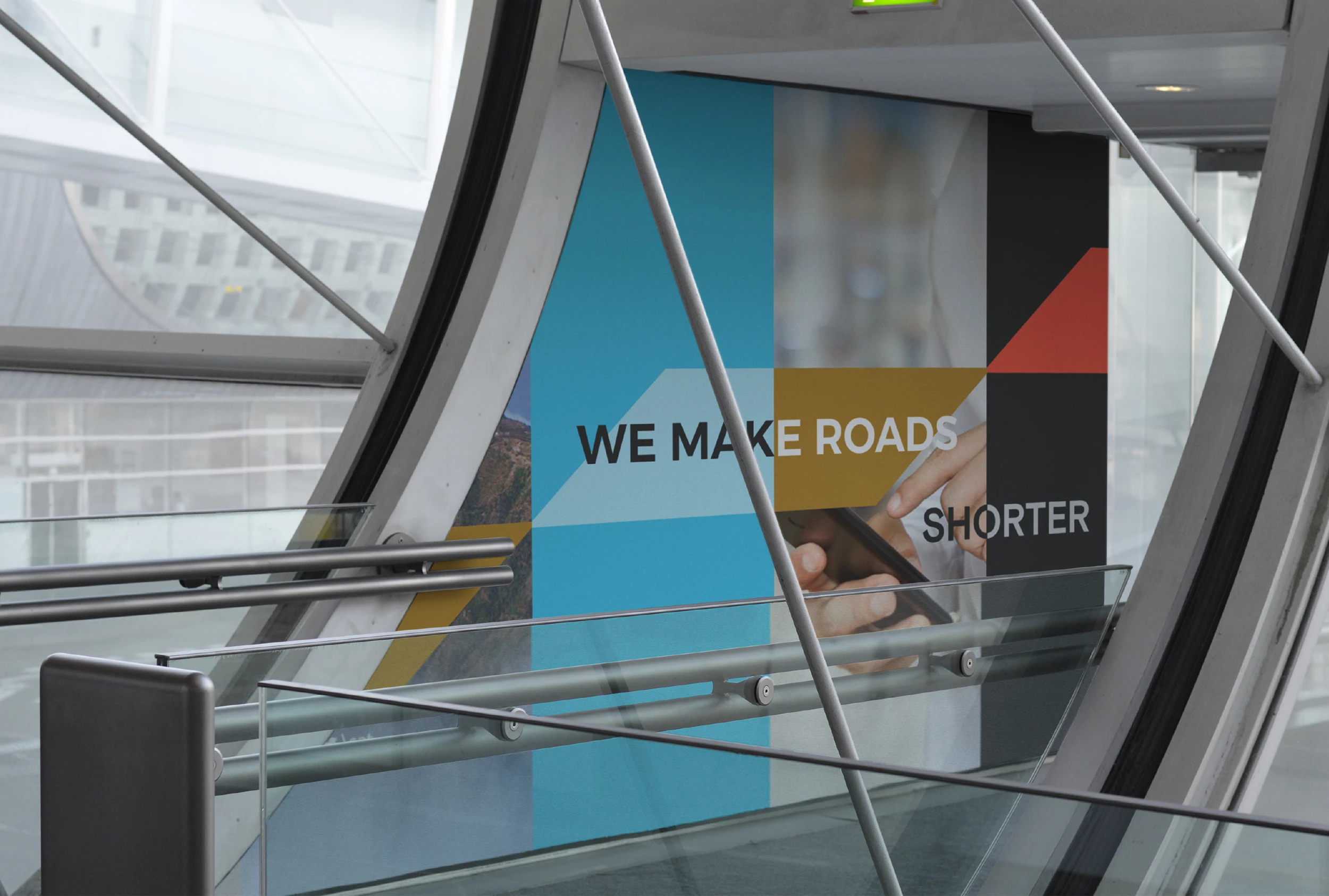
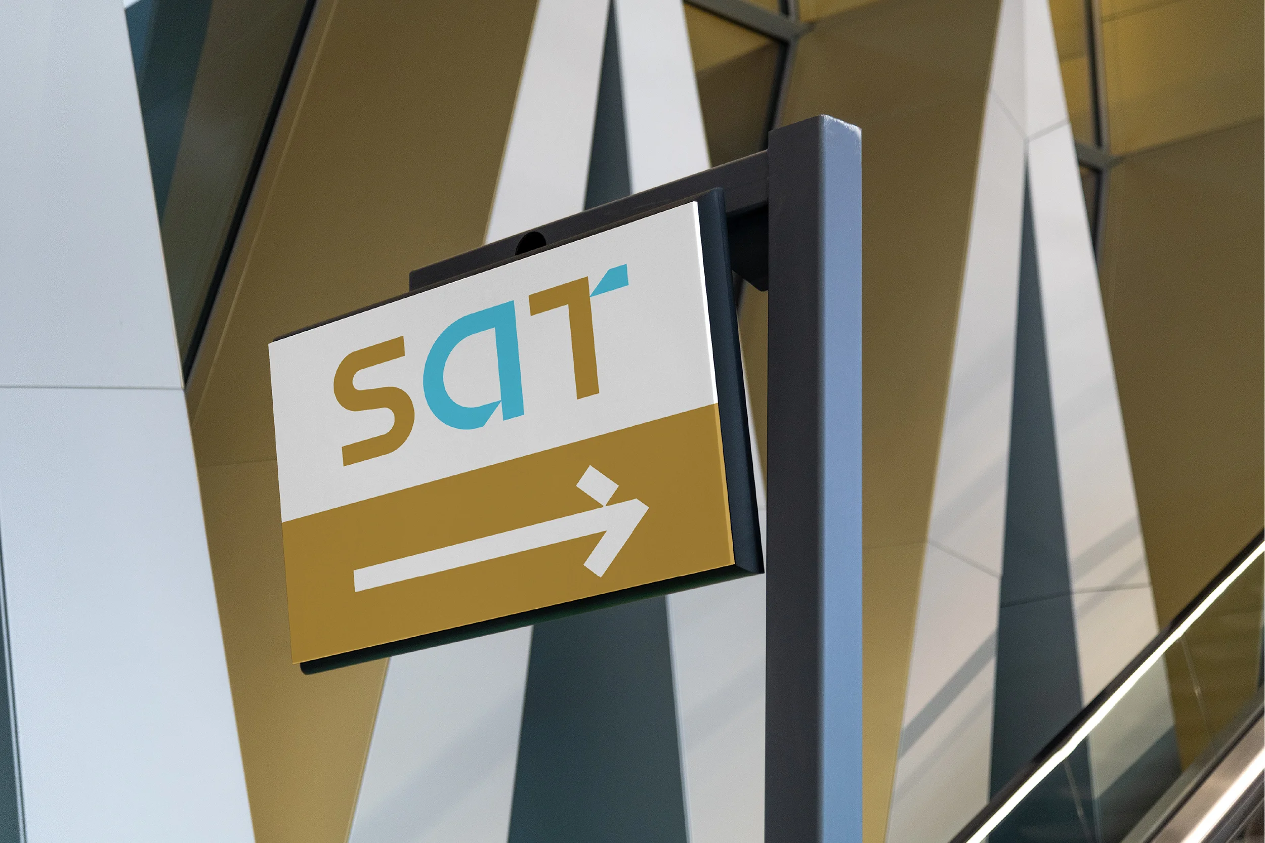
The development process began with an in-depth study of the land transport sector, audience expectations, and global branding trends. The identity was built on a visual blend of heritage and innovation. A color palette was selected to reflect the partners’ history and stability, with gold representing SAPTCO’s legacy and distinction, while blue symbolizes the innovation and reliability embodied by Alsa.
Parallel lines were introduced across the buses to represent continuous movement and dual paths, symbolizing progress and continuity. These elements function as visual messages that express mobility and community connection in a cohesive and harmonious way.
A complete brand strategy and messaging system was developed with a professional yet warm tone, ensuring consistency across advertising, digital platforms, and user experience. The identity was translated into reality through a comprehensive brand guidelines manual that safeguards consistency across all touchpoints.
With the launch of the new identity, SAT became a symbol of successful partnership between SAPTCO and Alsa, and of innovation in land transportation within the Kingdom. At Rbeez, we are proud of this collaboration and honored to be part of this inspiring journey.
Scope of work
Brand and identity development for the subsidiary SAT.
Naming.
Brand strategy.
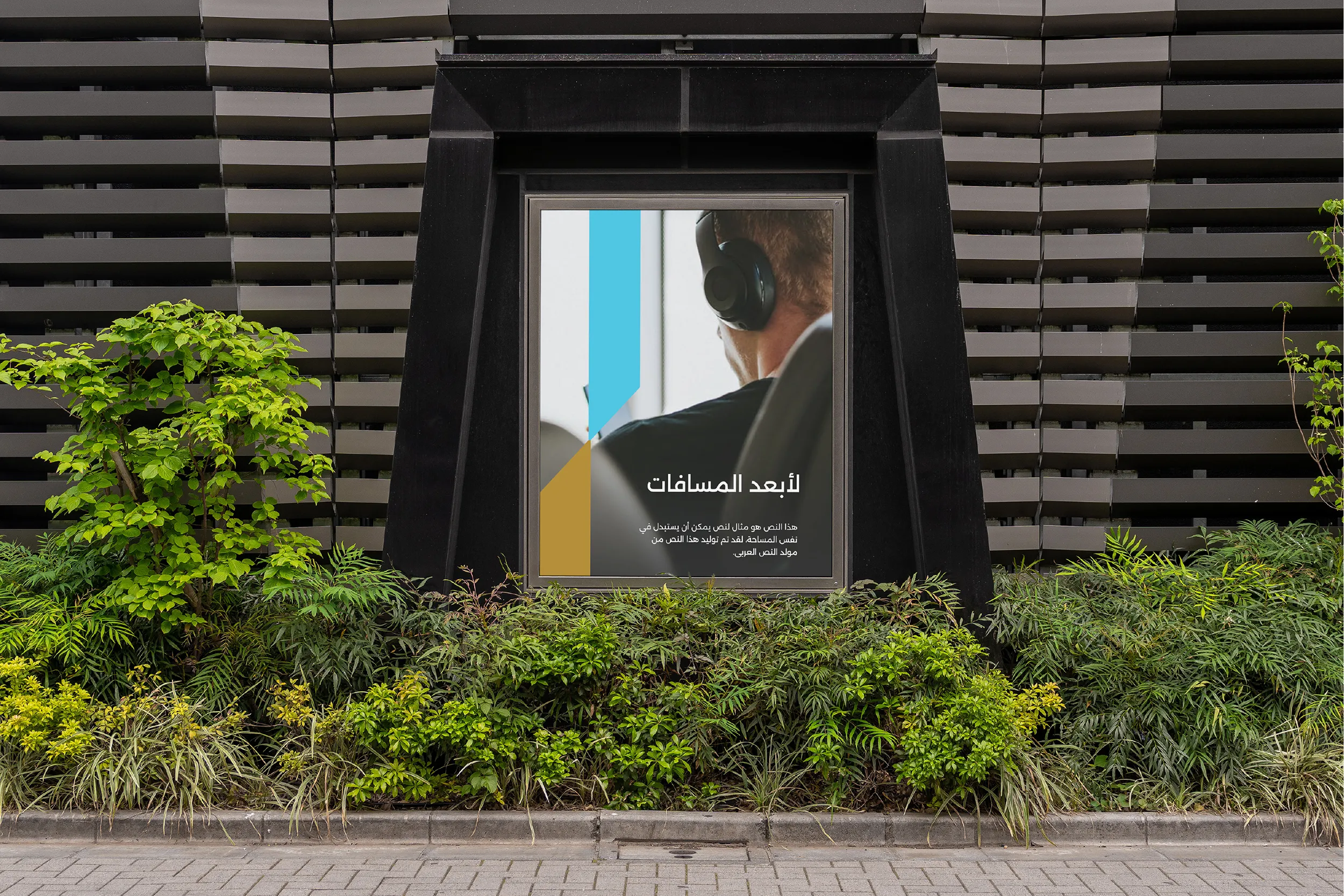
Brand messaging.
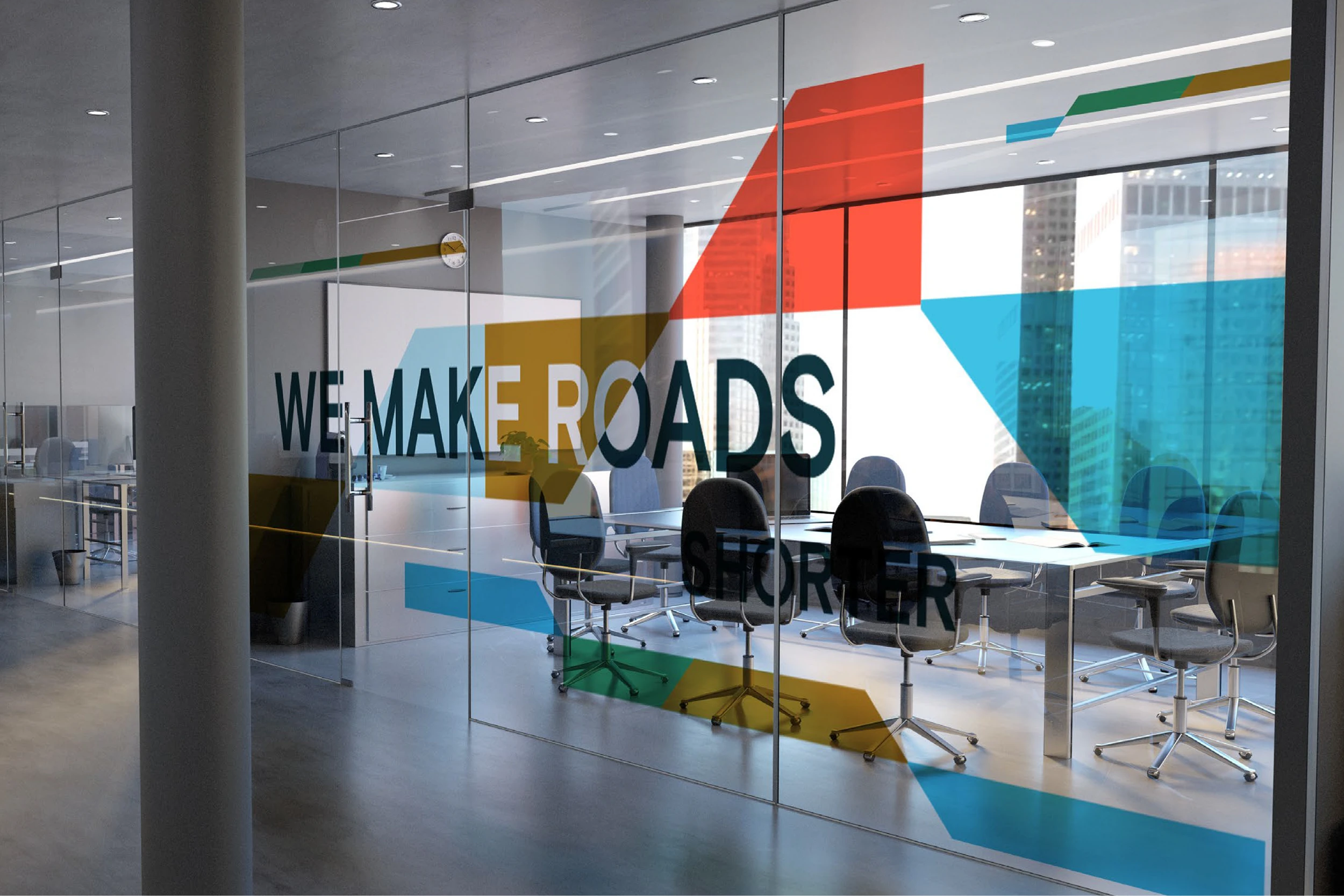
Graphic system.
Brand applications