Sail
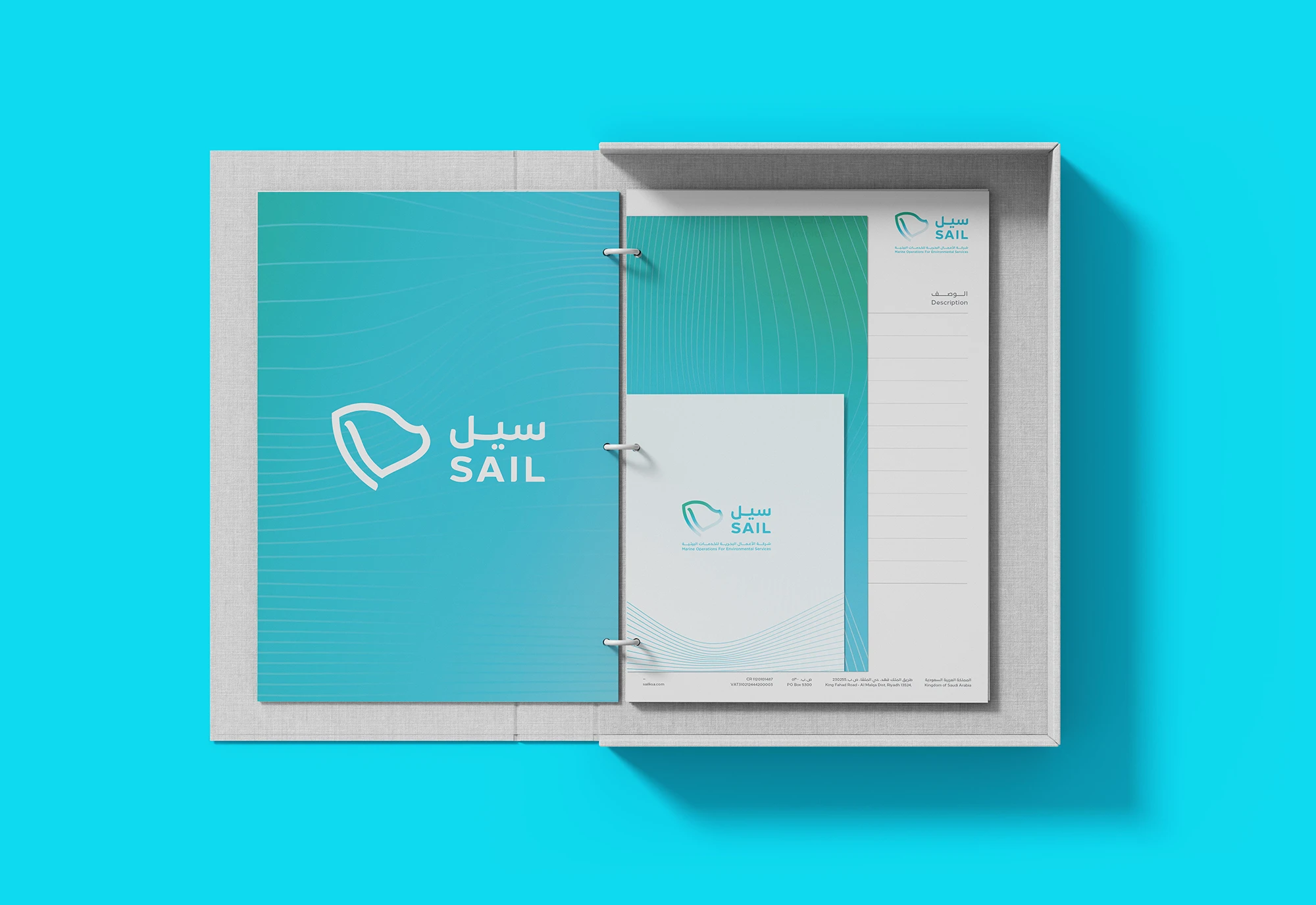
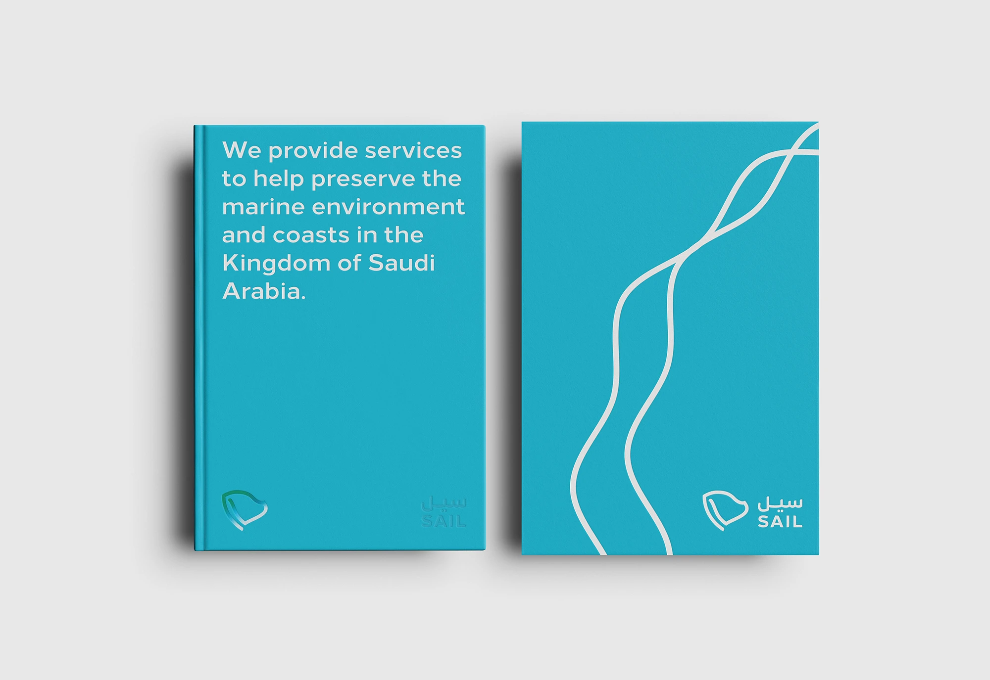
An identity inspired by the sail, in both form and spirit.
The challenge
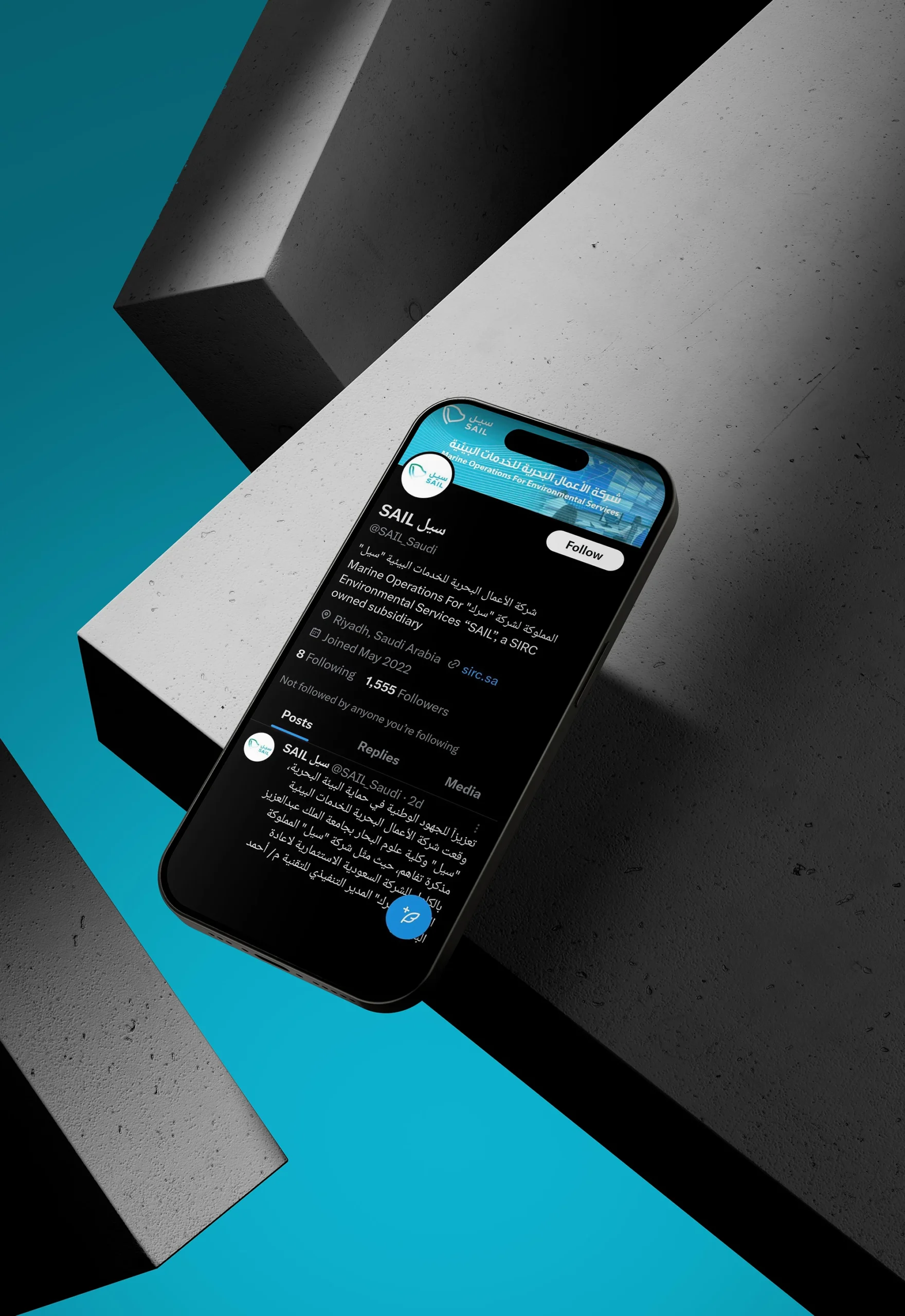
SIRC established a specialized subsidiary to monitor oil spills and hazardous materials along coastlines and at sea, ensuring rapid response to protect marine environments and support environmental sustainability. The challenge was to create a strong visual and verbal identity and brand strategy that reflects innovation, conveys operational readiness, and draws strength from the parent brand.
What has been achieved
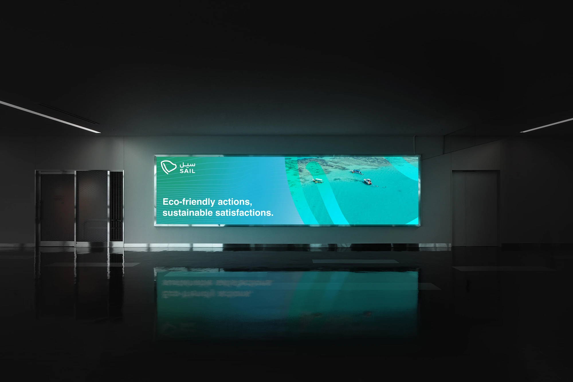
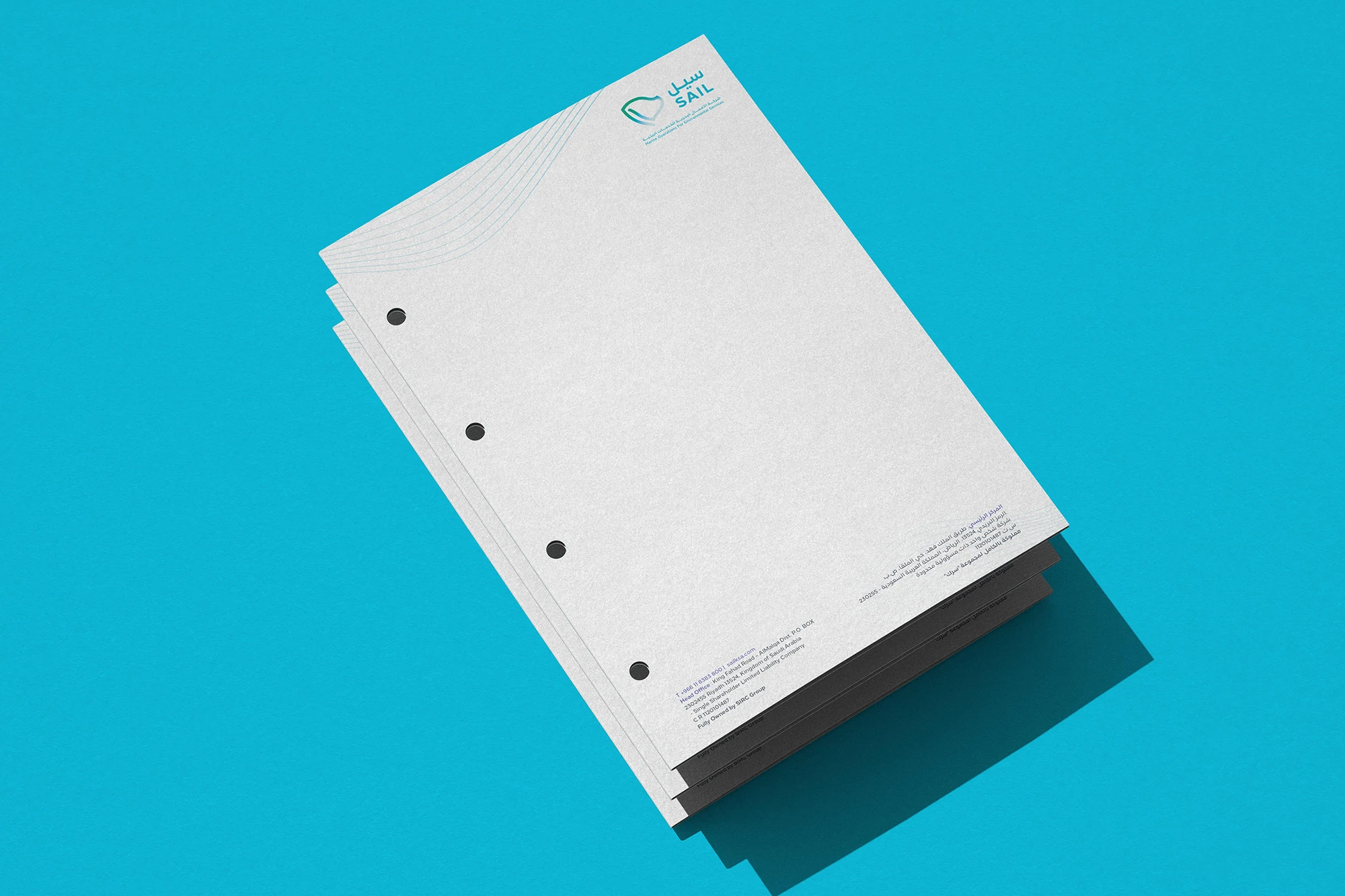
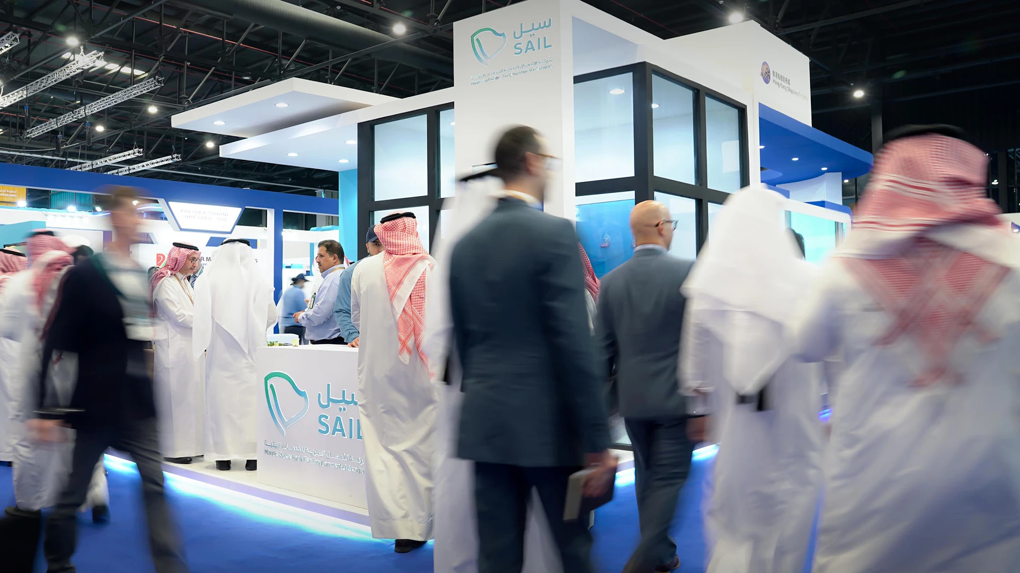
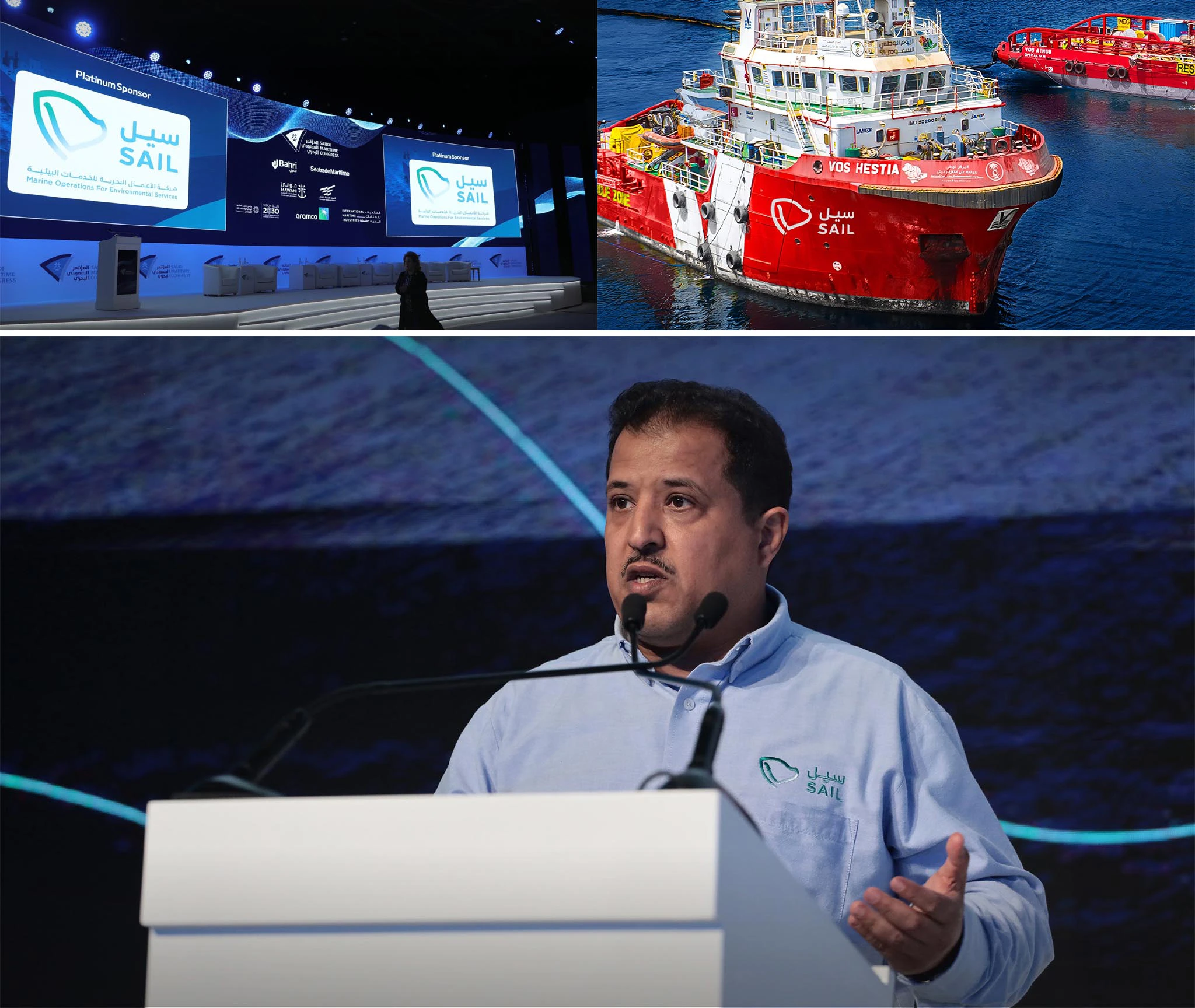
Through in-depth research, Rbeez developed an integrated identity that portrays marine operations through a lens of technological leadership and advanced innovation. The Sail identity became the official voice and visual representative of the company across all internal and external channels. The comprehensive brand strategy clearly expressed the company’s mission and reinforced national sustainability efforts, positioning the identity as a true sail that drives both environmental and economic progress forward.
Scope of work
Logo and brand identity development
Naming
Graphic system
Brand applications
Brand guidelines
Brand messaging
Brand strategy
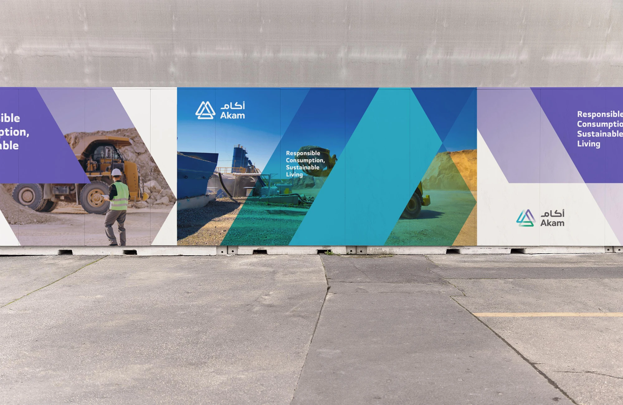
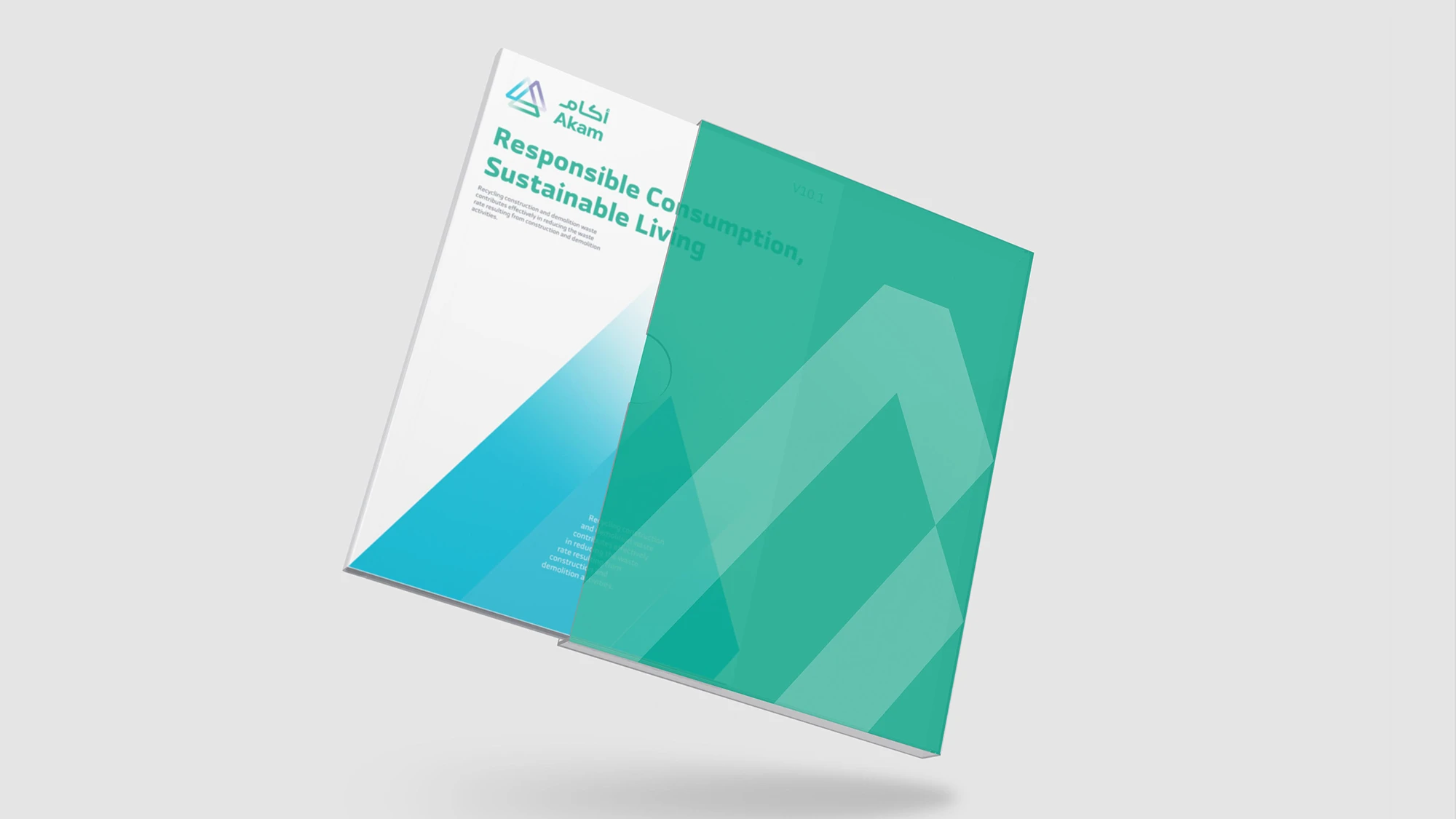
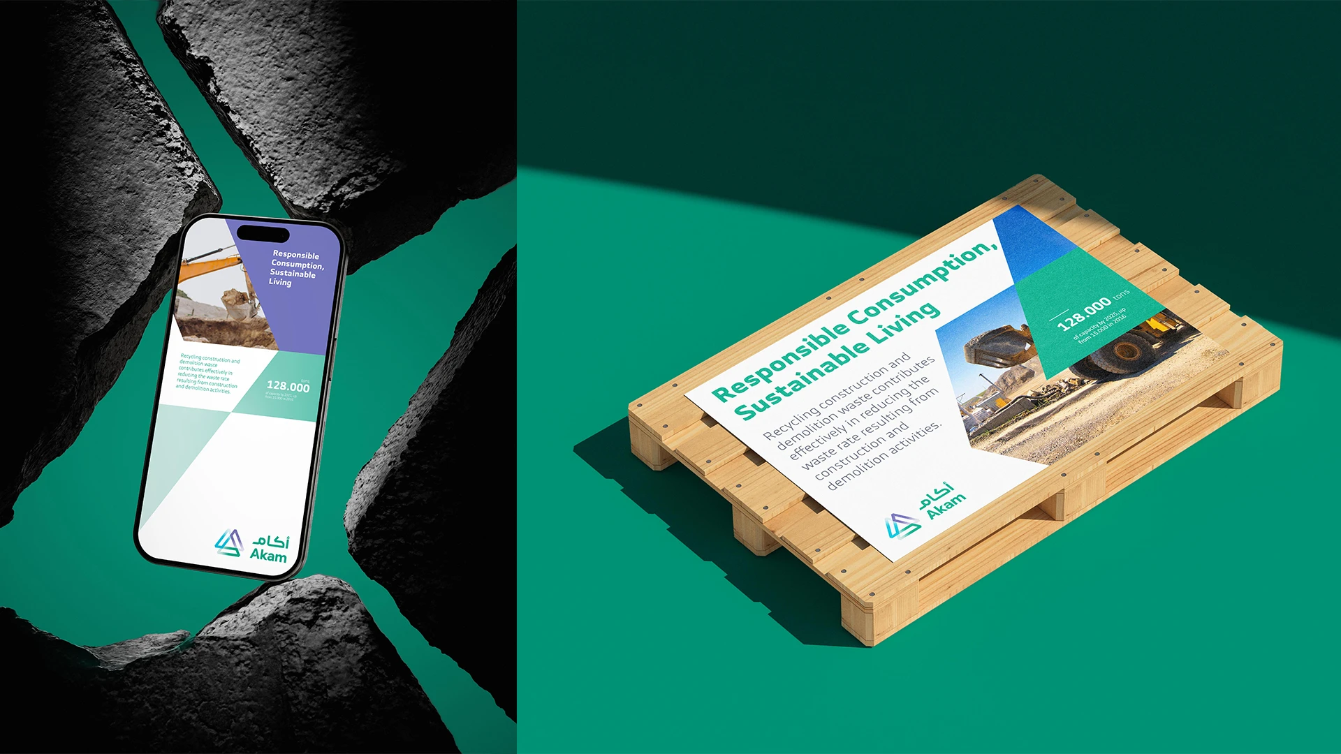
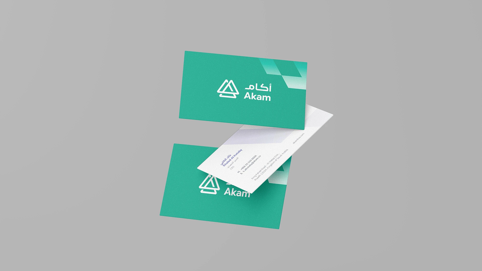
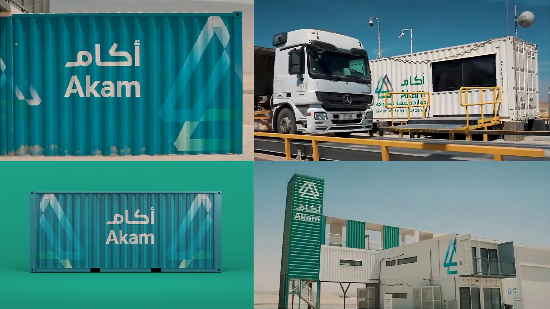
Akam
A complete identity giving Saudi recycling the recognition it deserves.
The challenge
As the national leader in circular economy waste management, SIRC established a specialized unit focused on collecting construction and demolition materials and converting them into reusable resources. The challenge was to develop a clear company strategy and a complete verbal and visual identity that reflects an innovative sustainability vision, while maintaining a strong connection to the parent brand.
What has been achieved
We translated the essence of recycling into a visual identity built around the concept of transformation, with strong emphasis on advanced technical processes reflected in the design details. Through a carefully structured brand strategy, we created strong brand pillars that communicate the company’s efficiency and its ability to maximize resources in service of the community. The verbal identity was crafted to reinforce this direction and support the company’s vision, both today and in the future.
Scope of work
Logo and Identity Creation, Naming, Graphic System, Identity Applications, Identity Guidelines, Brand Messages, Brand Strategy.
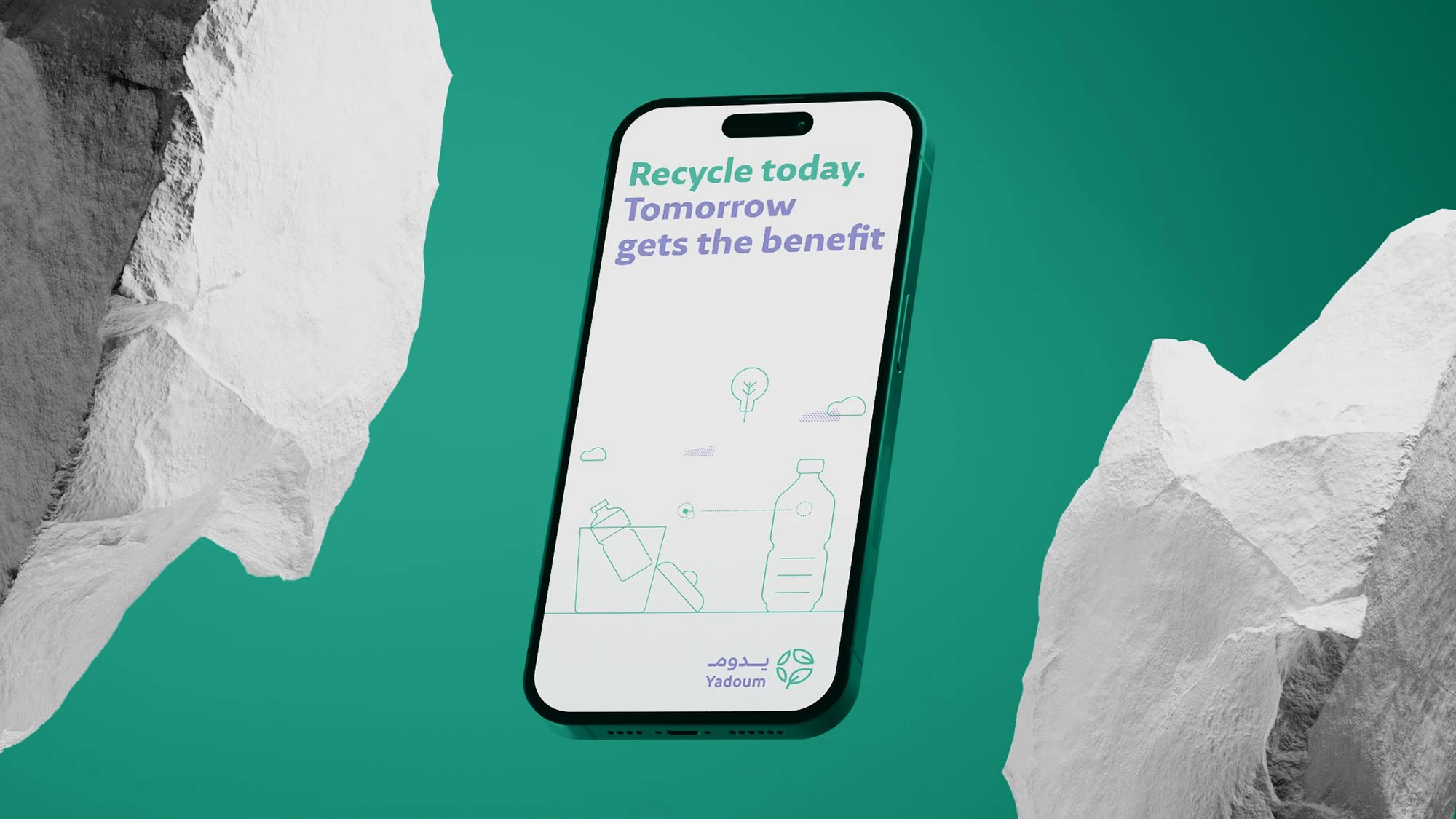
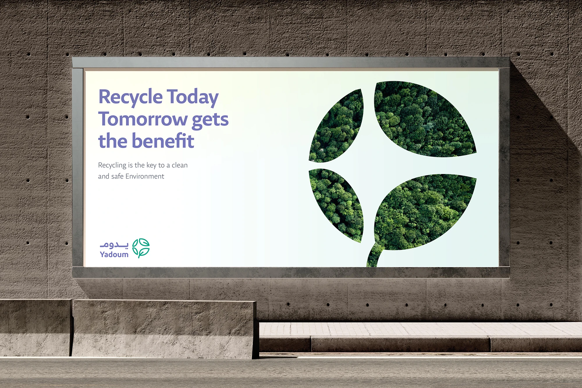
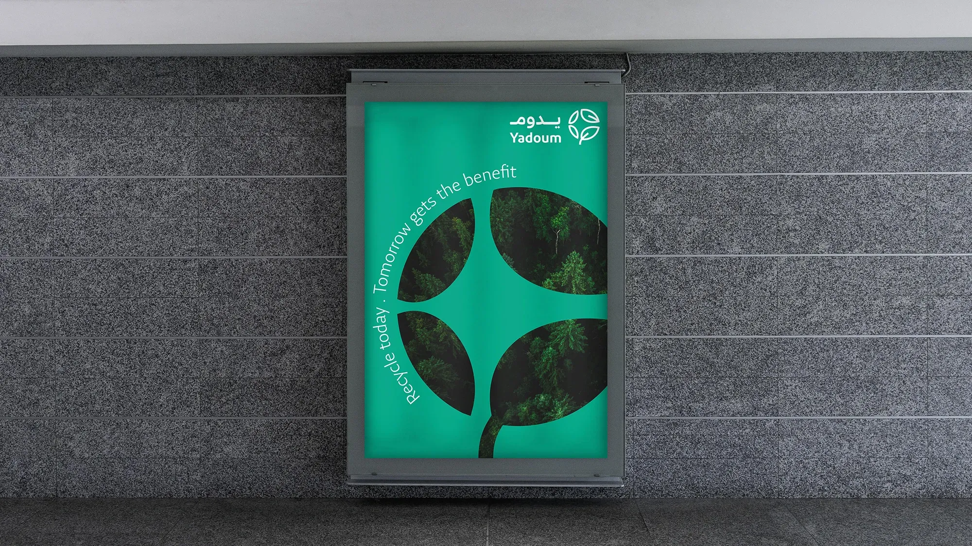
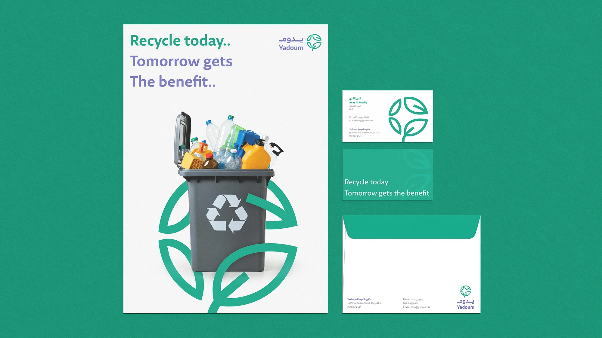
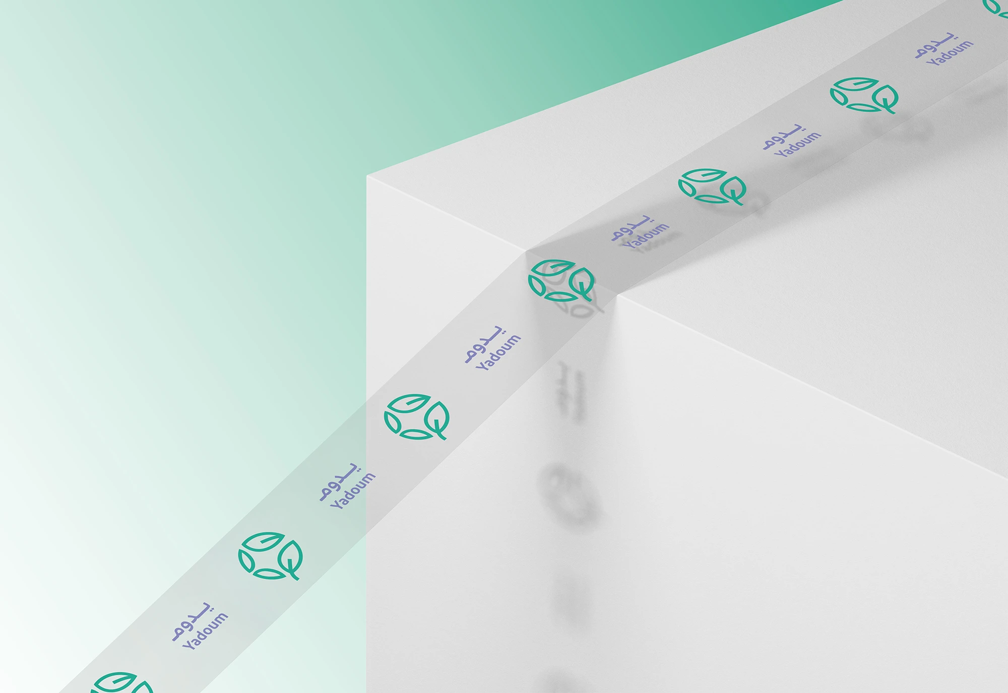
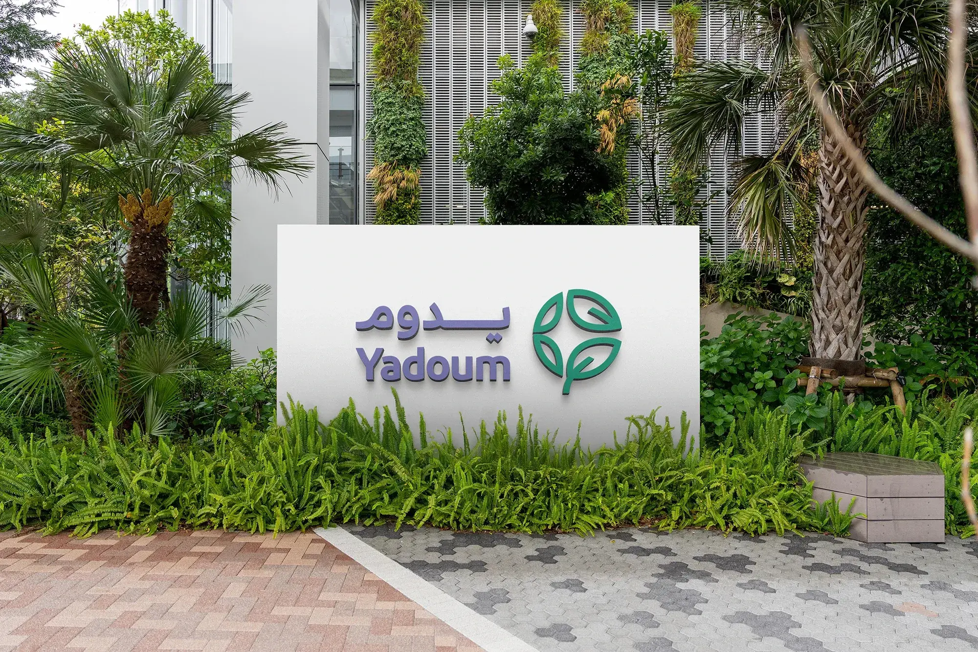
Yadoum
Renewable energy shaped by sustainability, from its roots to its future.
The challenge
SIRC established a specialized subsidiary focused on converting solid waste into alternative energy that supports the Kingdom and future generations. The challenge was to create a complete visual and verbal identity and brand strategy that reflects national sustainability goals, responsible resource utilization, and strong alignment with the parent company.
What has been achieved
We developed an identity system that firmly anchors the brand in sustainability while positioning it within the national drive toward self-sufficiency and clean energy. The visual and verbal language clearly communicates environmental responsibility and circular economic value, enabling the brand to consistently represent its mission across all official platforms and communication channels. Yadoum’s identity now stands as a strong expression of its environmental commitment and operational purpose, fully aligned with its strategic and operational goals.
Scope of work
Logo and brand identity development
Naming
Graphic system
Brand applications
Brand guidelines
Brand messaging
Brand strategy

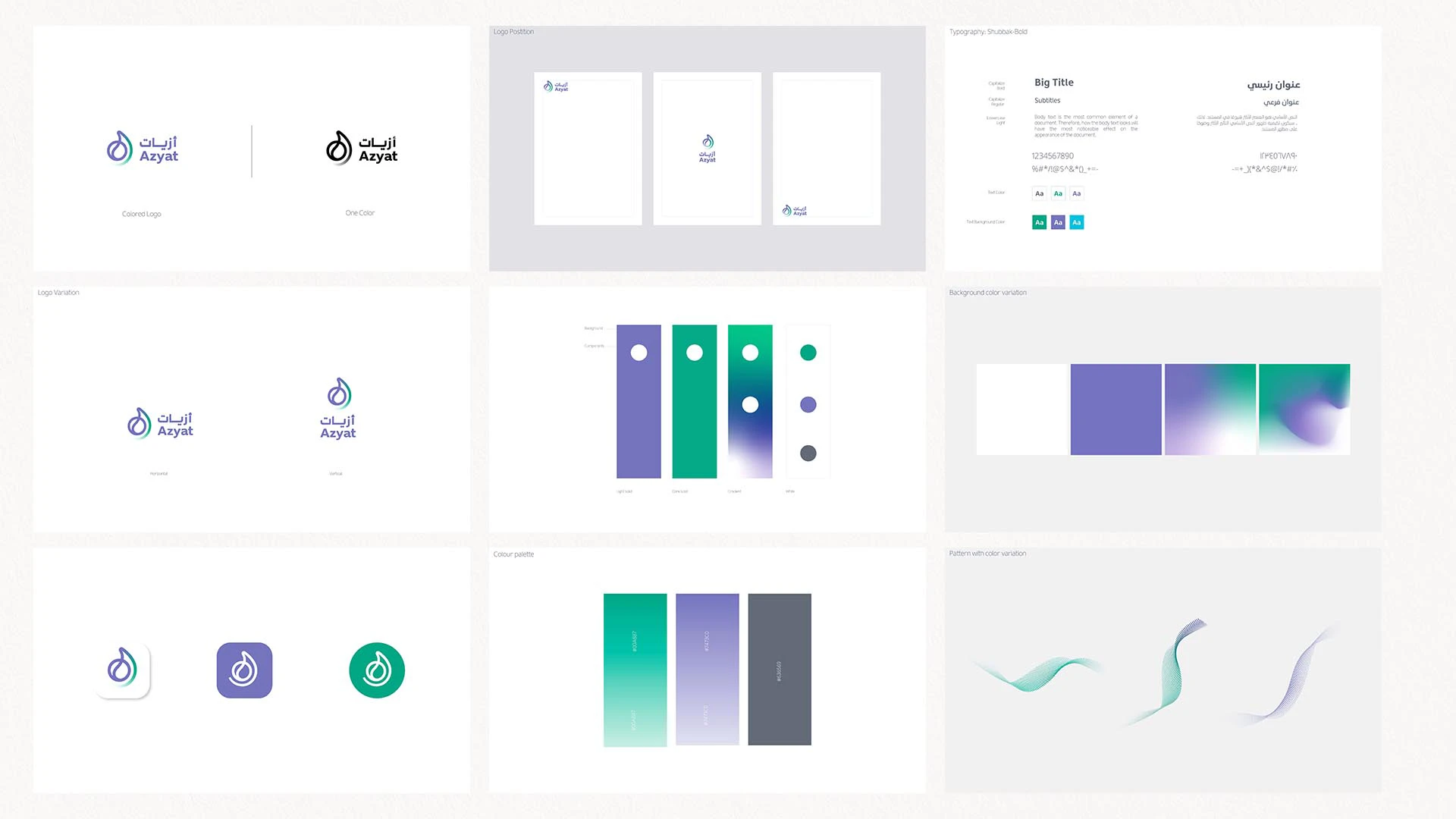
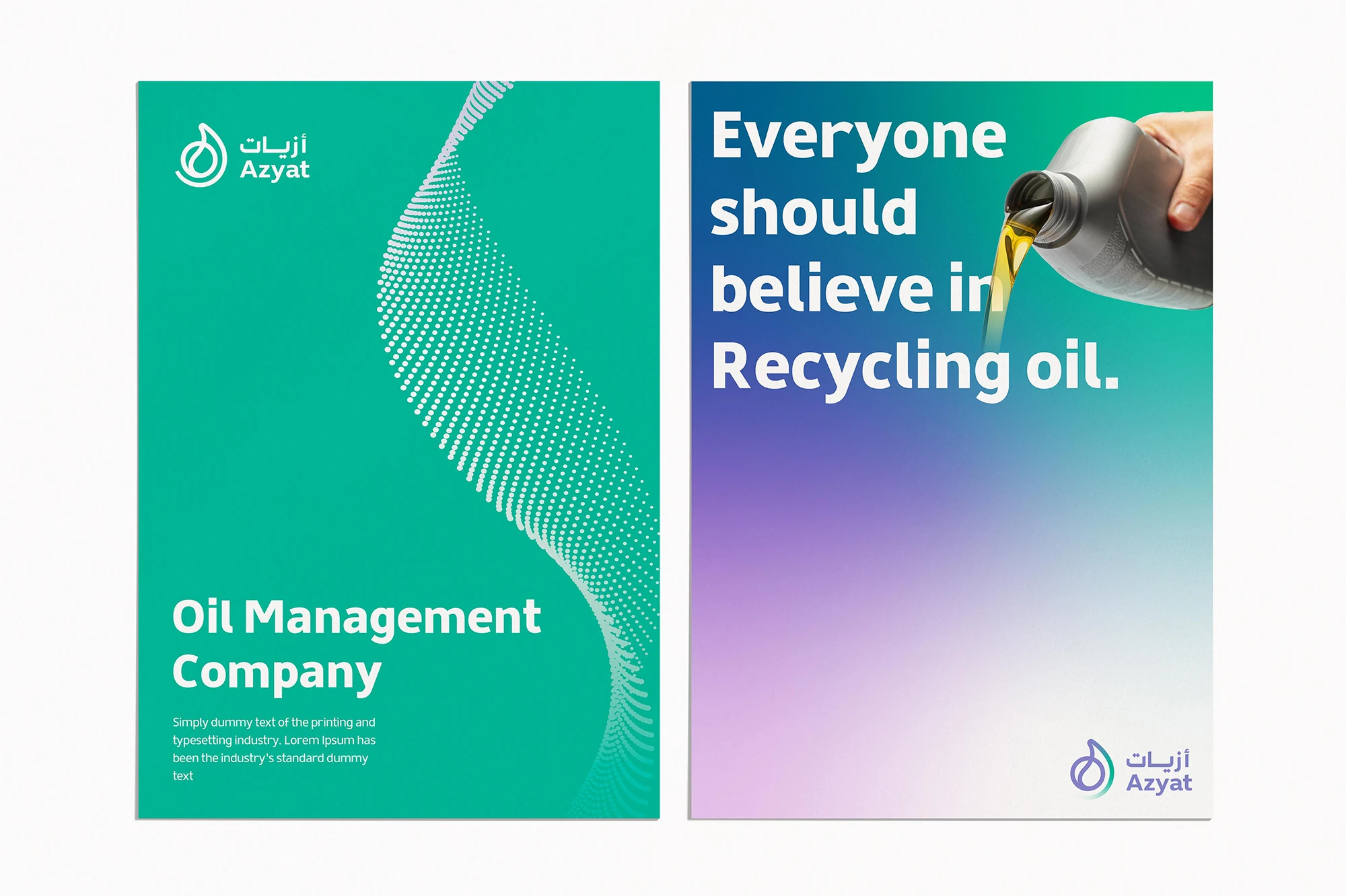
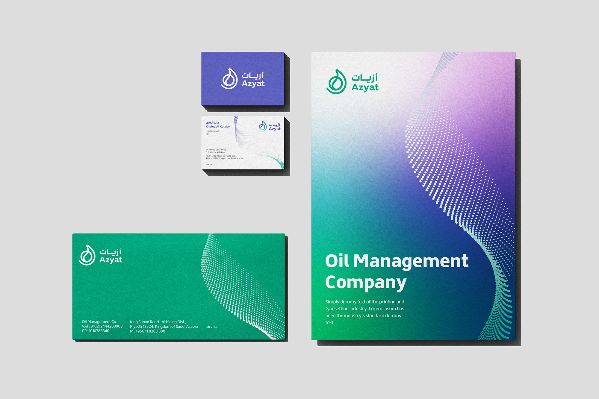
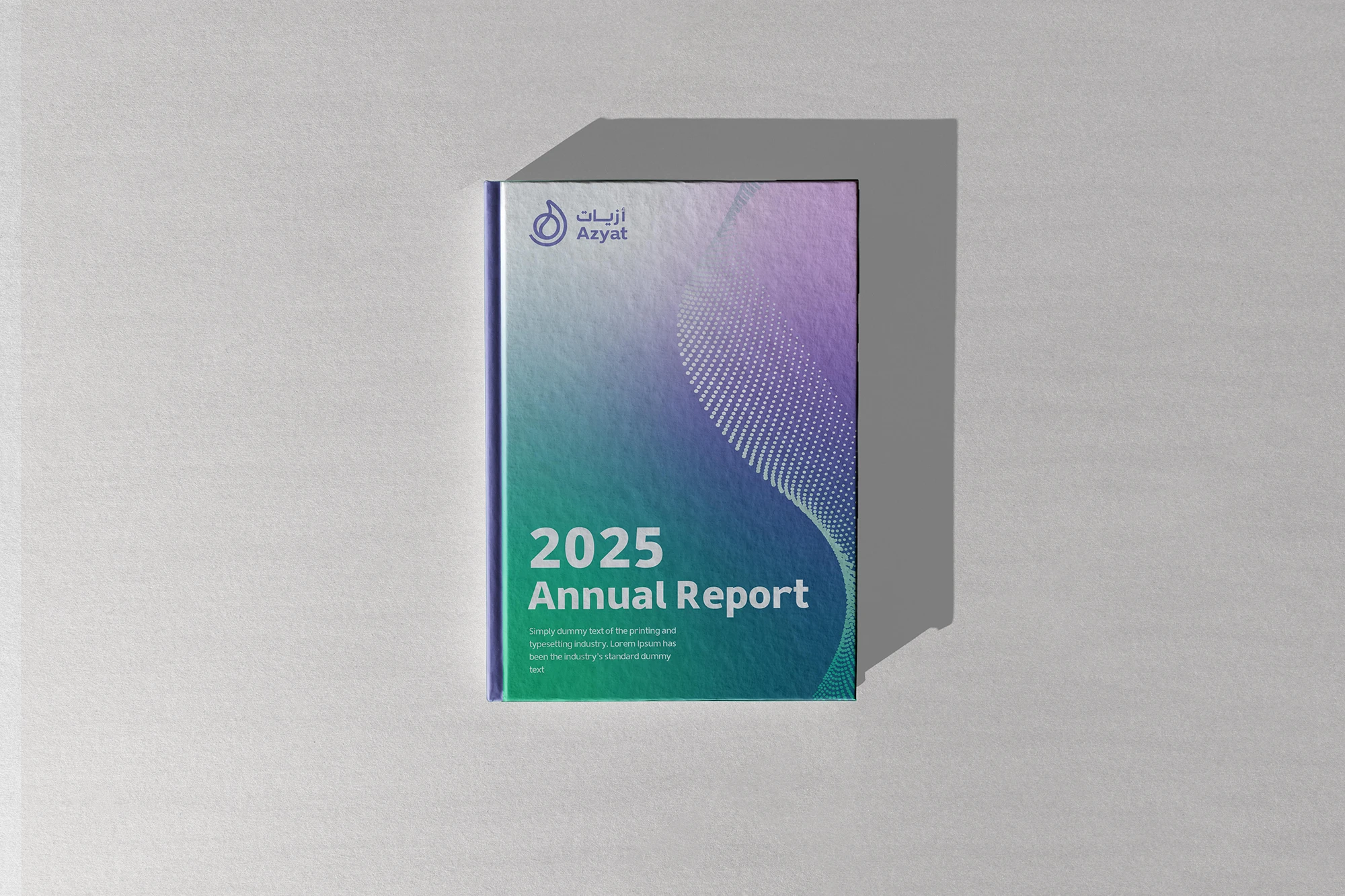
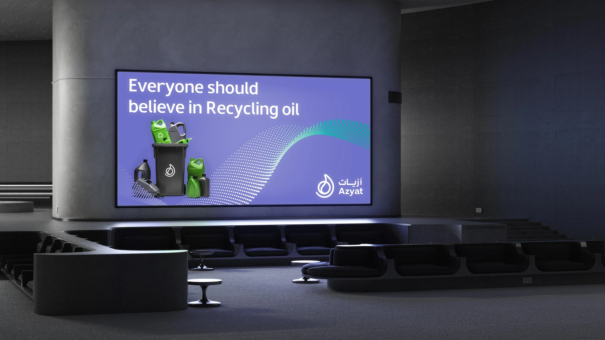
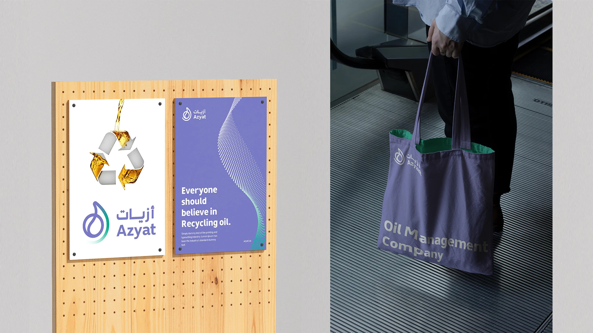
Azyat
Azyat, a national mark in the circular economy, built on a clear and integrated identity.
The challenge
SIRC, the national leader in waste management through the circular economy, established a specialized subsidiary focused on collecting used oils from vehicles, restaurants, and households, then processing them into usable biofuel. The challenge was to build a complete verbal and visual identity, along with a brand strategy, that reflects the national vision for innovative resource use and long-term value creation. At the same time, the new identity needed to remain clearly connected to the parent brand.
What has been achieved
Rabeez developed a clear and distinctive verbal identity that makes the company’s field easy to understand and strengthens its communication. Through technical and creative studies, we also built a modern visual identity that reflects national innovation and supports a strong market presence.
Azyat’s identity is simple, clear, and dynamic, with a technical character that reflects the nature of the business. It supports the company’s positioning and aligns its circular operations with environmental sustainability goals and future plans.
Scope of work
Logo and Identity Creation, Naming, Graphic System, Identity Applications, Identity Guidelines, Brand Messages, Brand Strategy
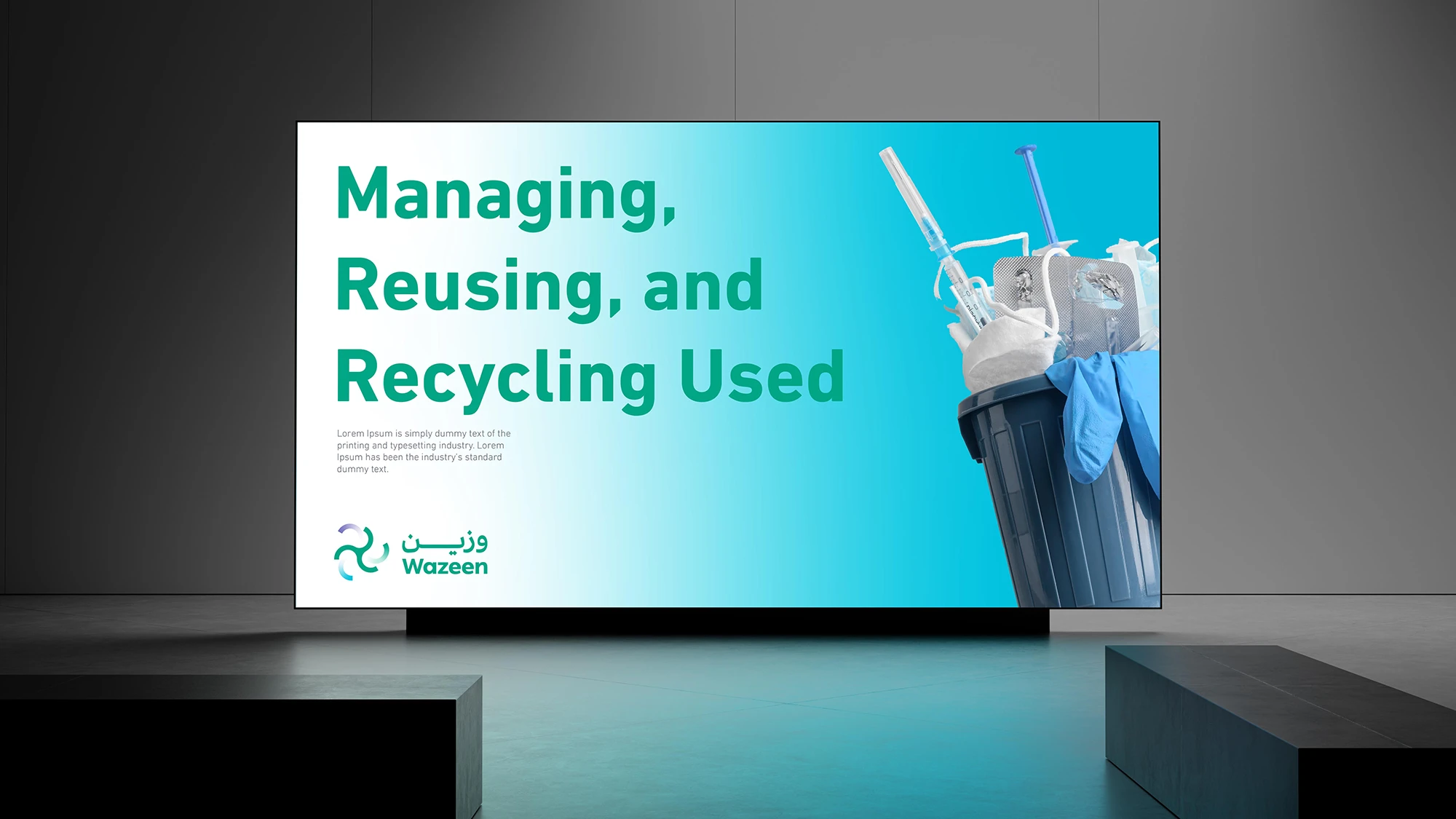
Wazeen
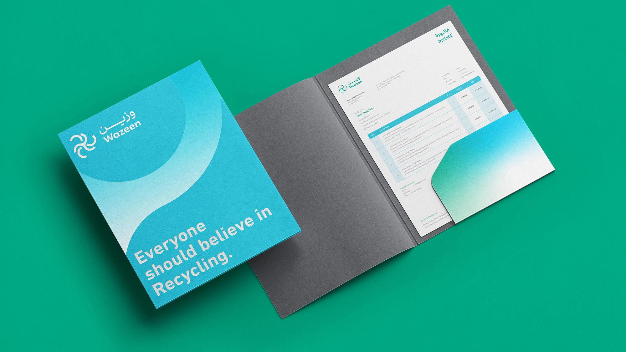
A cohesive identity that reshapes medical recycling with balance and purpose.
The challenge
SIRC, the national leader in waste management through the circular economy, established a specialized unit dedicated to processing medical waste generated by hospitals and clinics within waste treatment facilities. The goal was to help protect the environment and reduce the risks associated with medical waste. This challenge called for building a complete visual and verbal brand identity and a clear brand strategy that reflects the Kingdom’s forward-looking vision for safe and responsible medical waste recycling, in support of a sustainable society.
What has been achieved
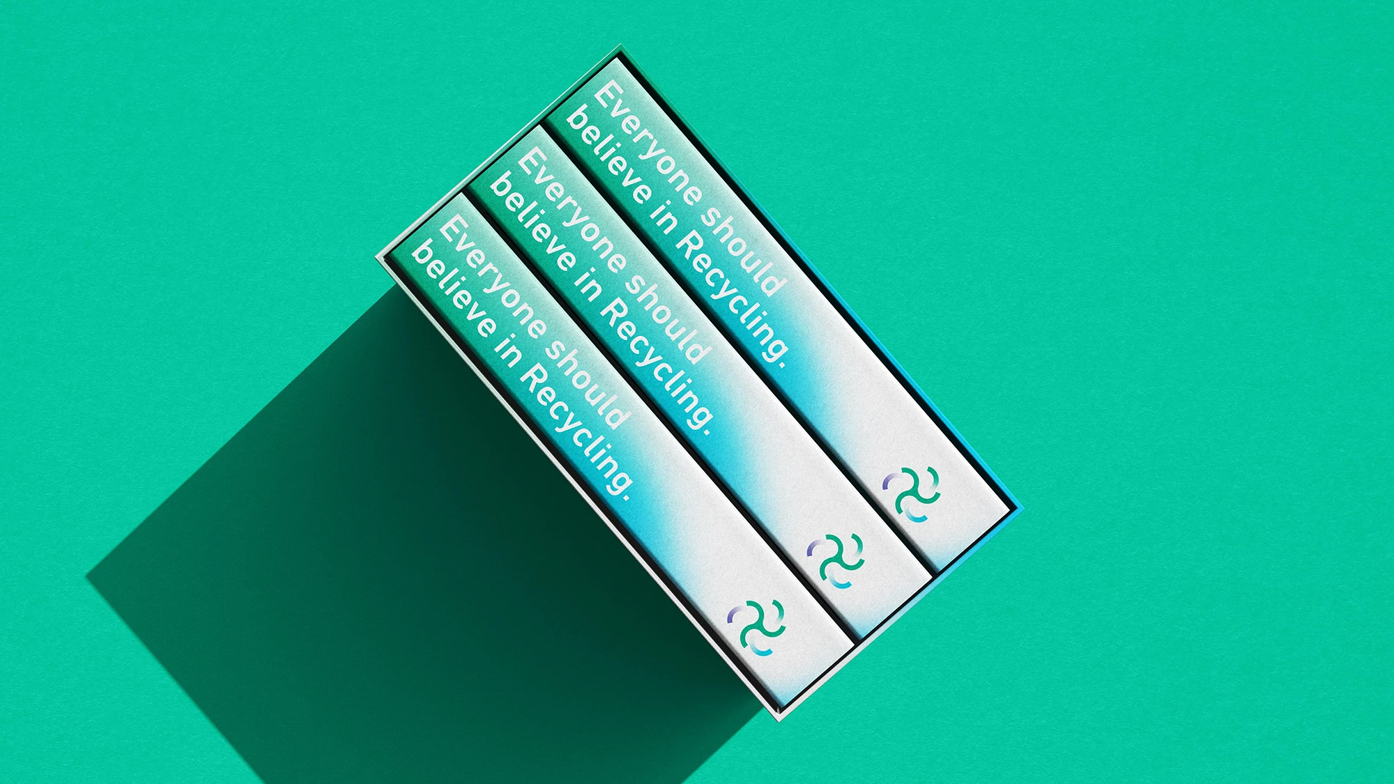
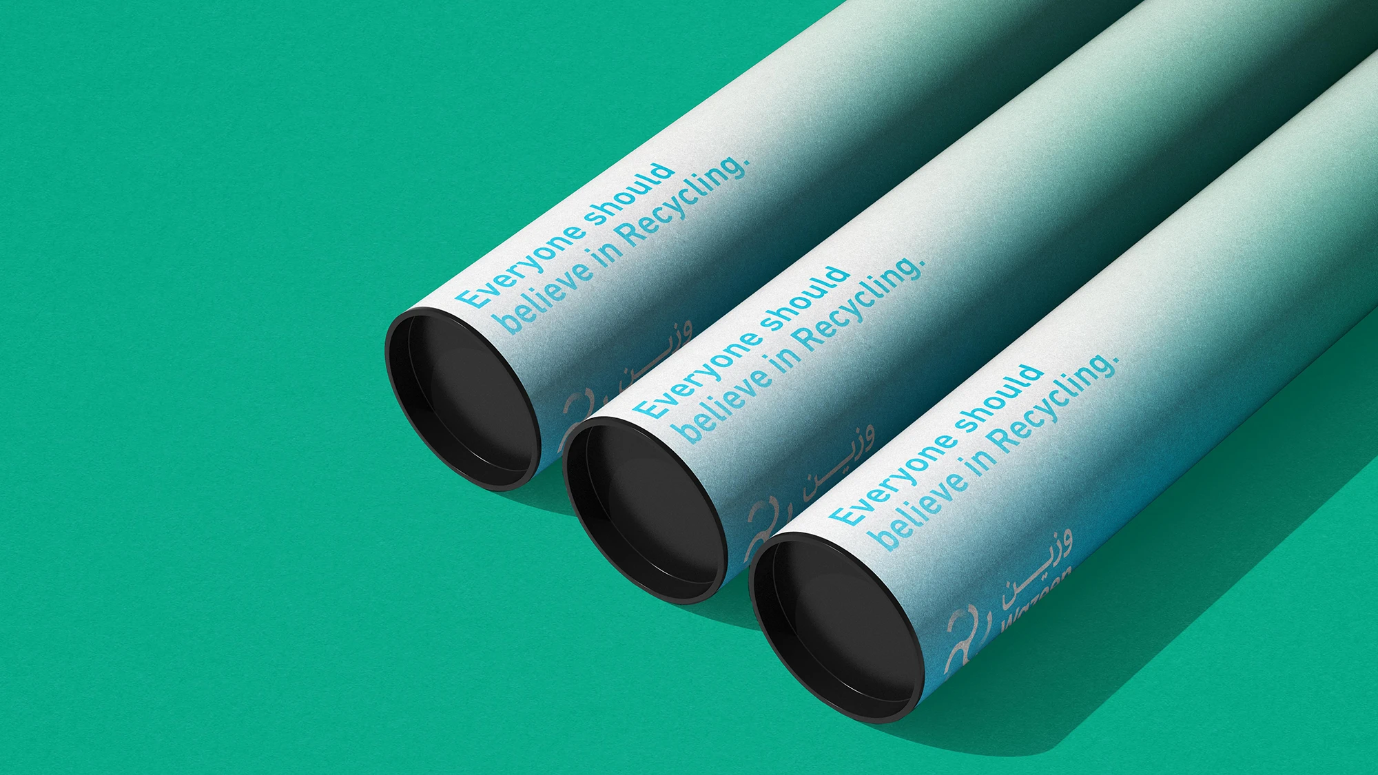
Rabeez successfully crafted a comprehensive brand identity that captures the company’s innovative spirit and precise execution through its visual and verbal elements. The identity reflects a commitment to delivering safe and responsible solutions for medical waste management, in line with sustainability and environmental protection goals. Today, the “Wazeen” identity represents the concept of medical circular economy with balance and professionalism. It aligns seamlessly with sustainability values and establishes a strong presence in the market, echoing the company’s vision and future ambitions.
Scope of work
Logo and brand identity development
Naming
Graphic system
Brand applications
Brand guidelines
Brand messaging
Brand strategy

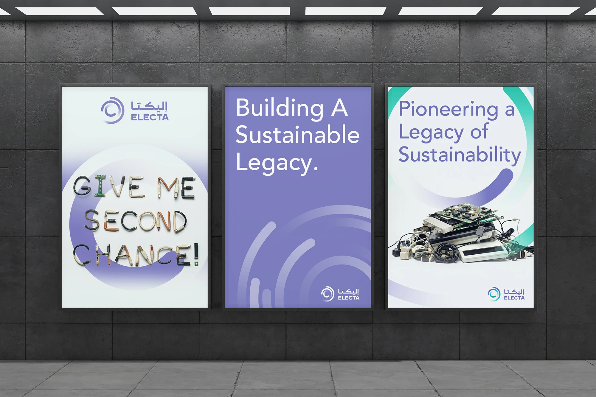
Electa
Responsible electronic and electrical processing, an identity aligned with sustainability.
The challenge
SIRC established a specialized subsidiary to collect and manage electronic and electrical waste across the Kingdom, protecting the environment from pollution and raising awareness of the risks associated with e-waste. The challenge was to build a complete visual and verbal identity, along with a brand strategy, that reflects the national vision for responsible technology disposal and long-term community sustainability.
What has been achieved
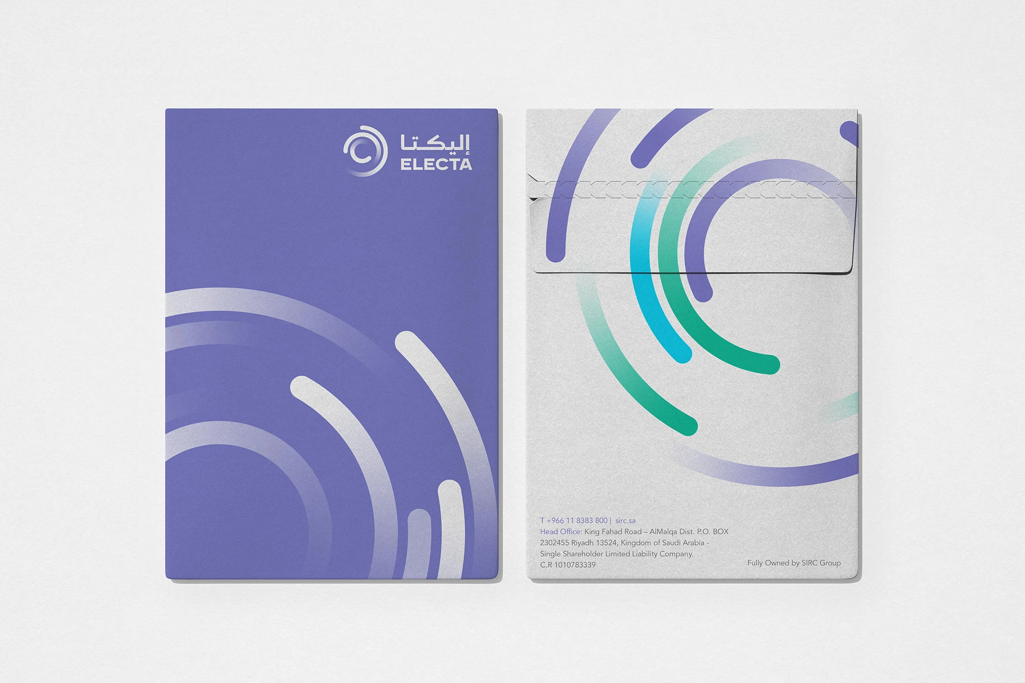
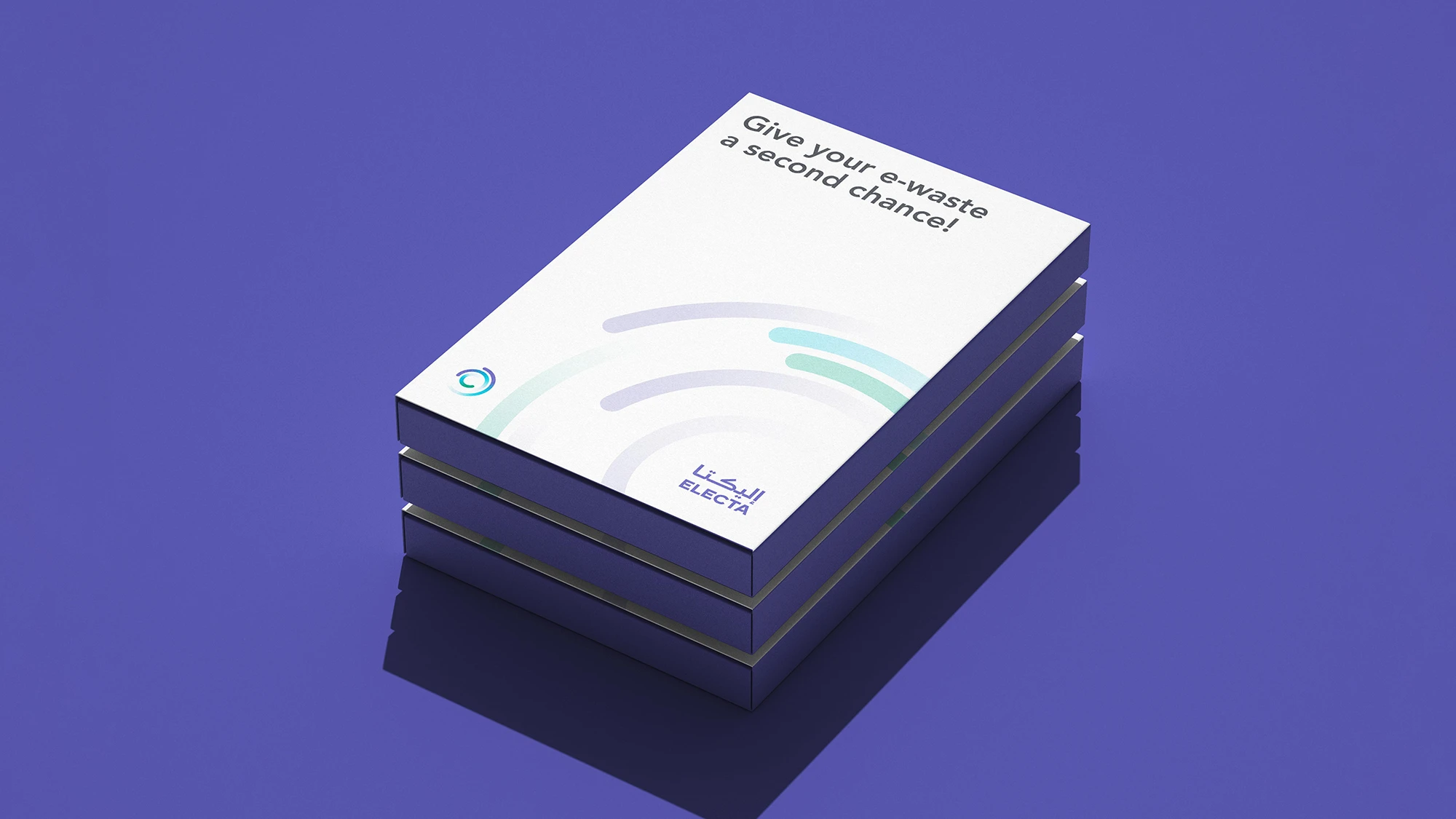
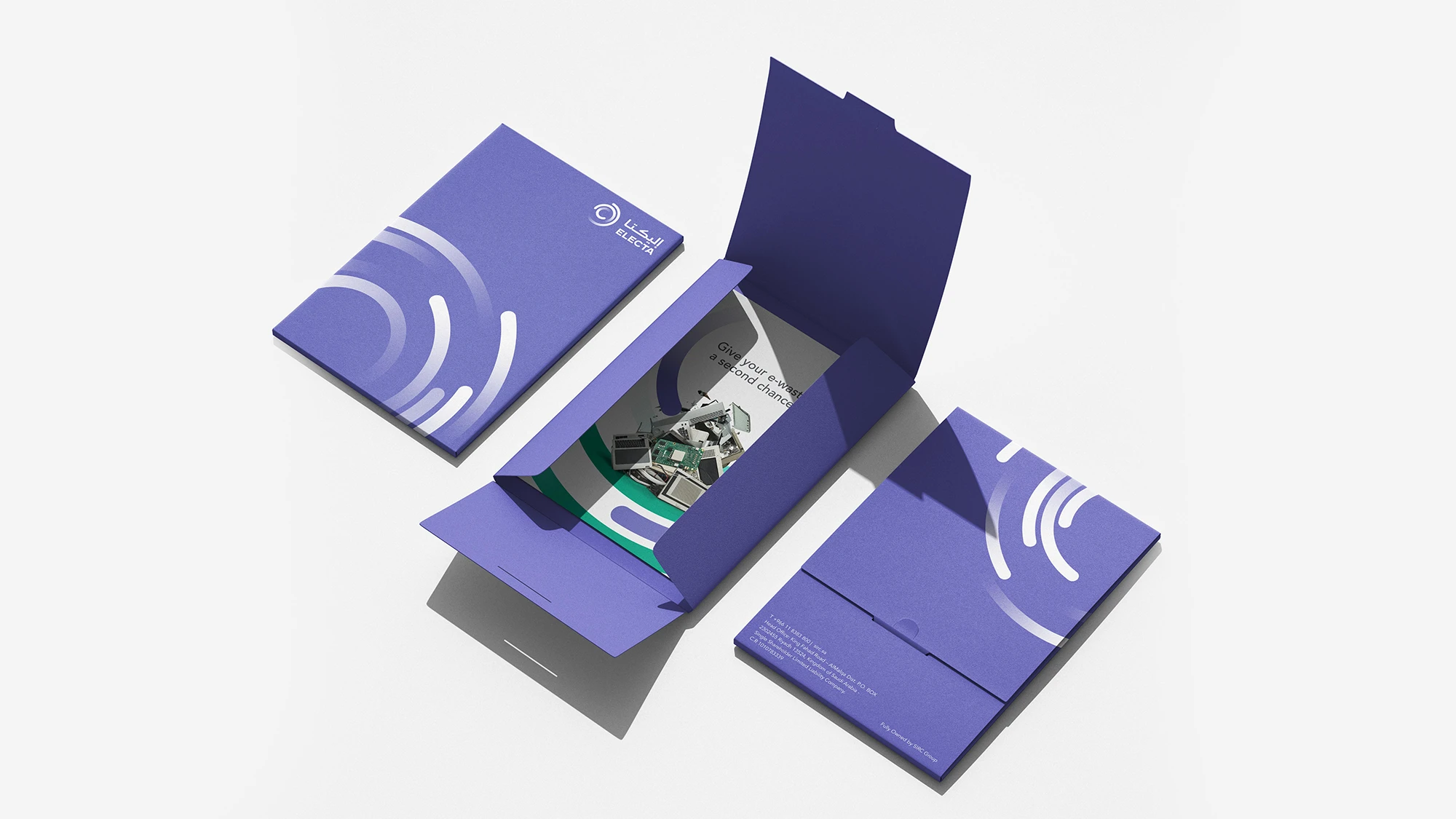
We developed a fully integrated visual and verbal system that clearly and dynamically reflects the company’s core operations. The identity expresses precision in processing and safe disposal, while establishing a distinctive innovative character that supports national sustainability goals and promotes responsible e-waste practices. The carefully built identity ensures consistent brand presence across every platform and communicating the company’s direction and professional standards with clarity, and supporting its journey toward a more sustainable and innovative future.
Scope of work
Logo and brand identity development
Naming
Graphic system
Brand applications
Brand guidelines
Brand messaging
Brand strategy